The 30 Day Map Challenge 2023
The themes are set by the challenge creator, Topi Tjukanov.
As is now the tradition, OS invited colleagues from across the business to sign up for individual days and challenged them to make a map based on the theme of the day.
To showcase the submissions from Ordnance Survey in 2023, Product Development Consultant Guy Heathcote has created a 3D virtual exhibition space – please have a wander around the gallery at your own leisure or scroll down to explore the maps in more detail.
Day 1 – Points
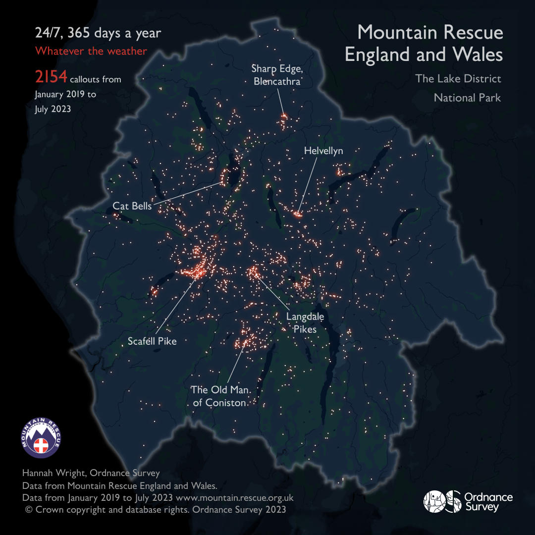
Whatever the Weather - Hannah Wright, Technical Relationship Consultant
To celebrate Ordnance Survey’s partnership with Mountain Rescue England and Wales (MREW) this data visualisation explores callouts attended to by MREW teams within the Lake District National Park between January 2019 and July 2023. It is designed to highlight the extraordinary work of the volunteer Mountain Rescue teams who are on call 24/7, 265 days of the year and go out to help, no questions asked, whatever the weather.
Day 2 – Lines
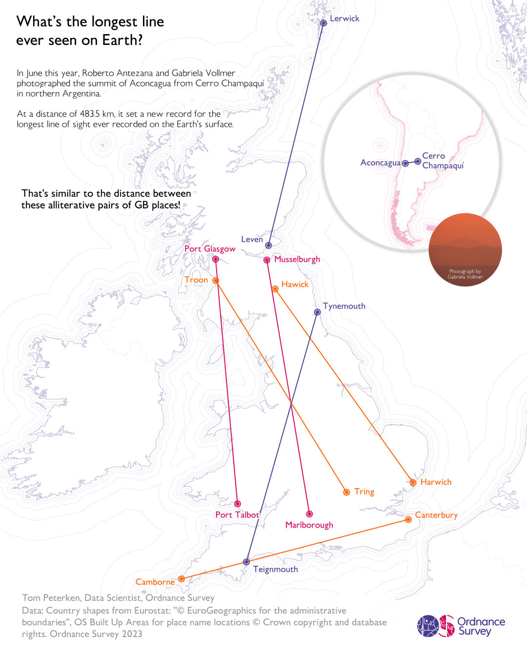
The Longest Line - Tom Peterken, Data Scientist
In June 2023, Roberto Antezana and Gabriela Vollmer set a new record for the longest line of sight ever photographed at 483.5 km across northern Argentina. That’s like seeing from Troon to Tring, from Hawick to Harwich, from Tynemouth to Teignmouth, from Canterbury to Camborne, from Port Talbot to Port Glasgow, from Leven to Lerwick, or from Marlborough to Musselburgh!
Day 3 – Polygons
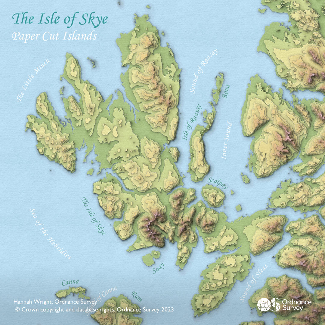
The Scottish islands are not only beautiful but are also topographically varied. Inspired by John Nelson’s paper cut style for ArcGIS Pro, these two attributes (beauty and varied topography) have been captured in this single visualisation of the landscape.
Day 4 – A bad map
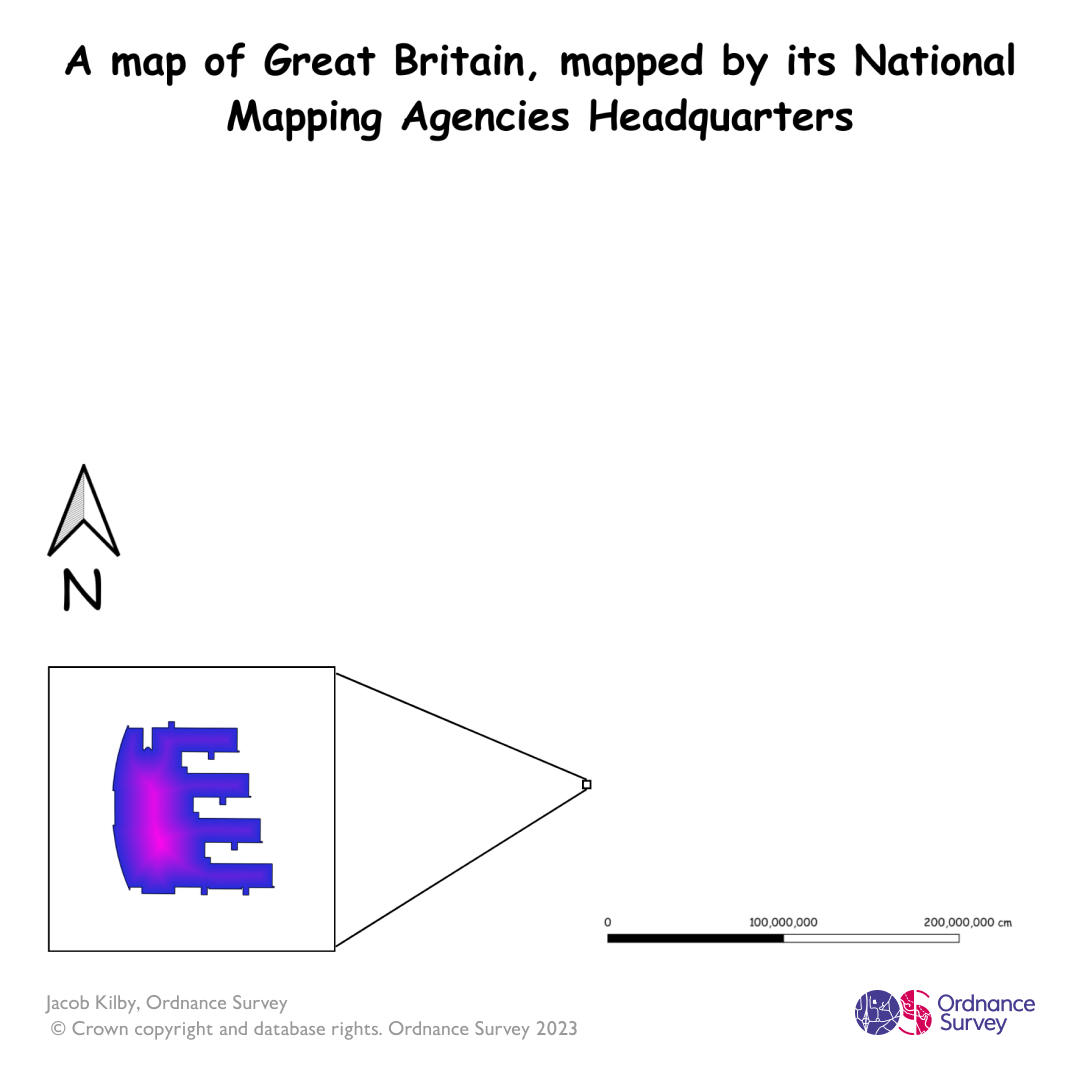
Great Britain mapped by its national mapping agency – Jacob Kilby, Data and Technology Graduate
This 'bad' data visualisation shows Great Britain, but uses a questionable measurement to show its main subject, and some unfortunate choices for rendering.
Day 5 – Analog Map
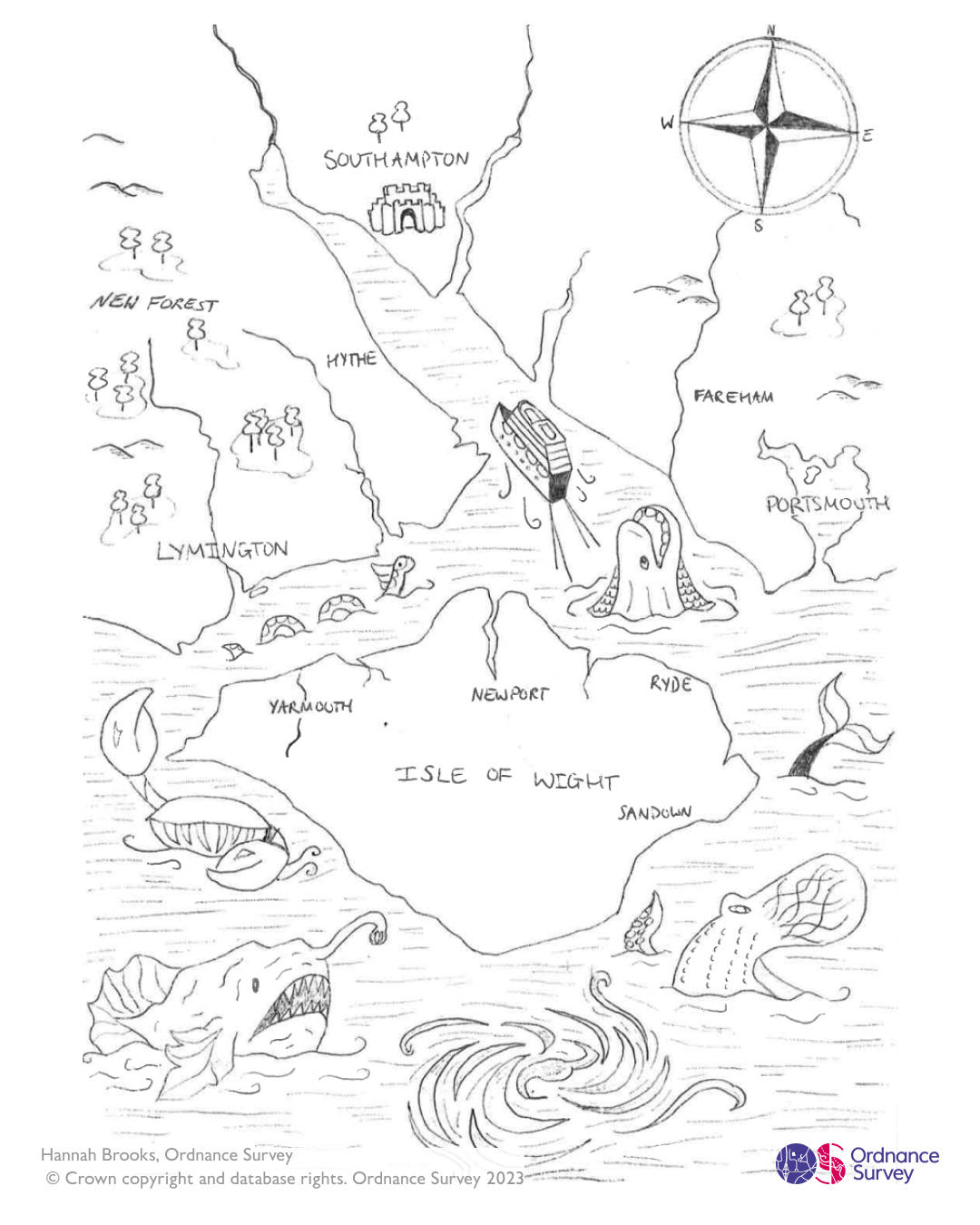
Solent Sea Monsters - Hannah Brooks, Geospatial Graduate
The map is inspired by the sea monsters that feature on Medieval and Renaissance maps. The Carta Marina by Swedish cartographer Olaus Magnus was the key inspiration for this map and the idea was to recreate its style for the Solent.
Day 6 – Asia
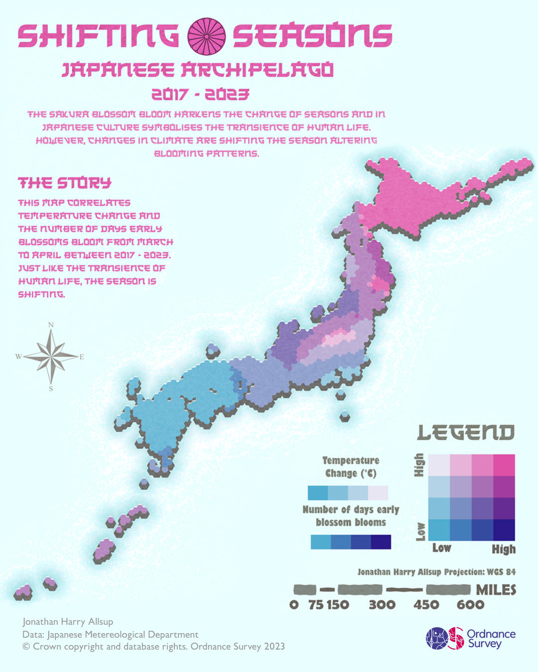
Shifting Seasons – Jonathan Allsup, Graduate
Using data from the Japanese Meteorological Department, Jonathan Allsup has created this beautiful bivariate hex map to explore and visualise the correlation between temperature change and the Sakura blossoms starting to bloom across Japan.
Day 7 – Navigation (Part 1)
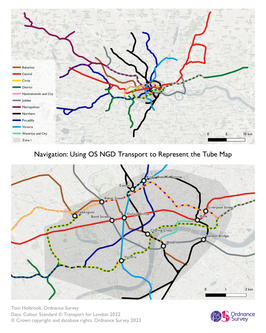
The Tube in real life – Tom Holbrook, Geospatial Graduate
This map uses the new OS National Geographic Database (NGD) Railway data to show the geographical location of London’s Tube network. The top map shows the whole of the network whilst the bottom map shows just zone 1, with key stations highlighted. These maps show a network that is very familiar to people but visualised in a different way.
Day 7 - Navigation (Part 2)
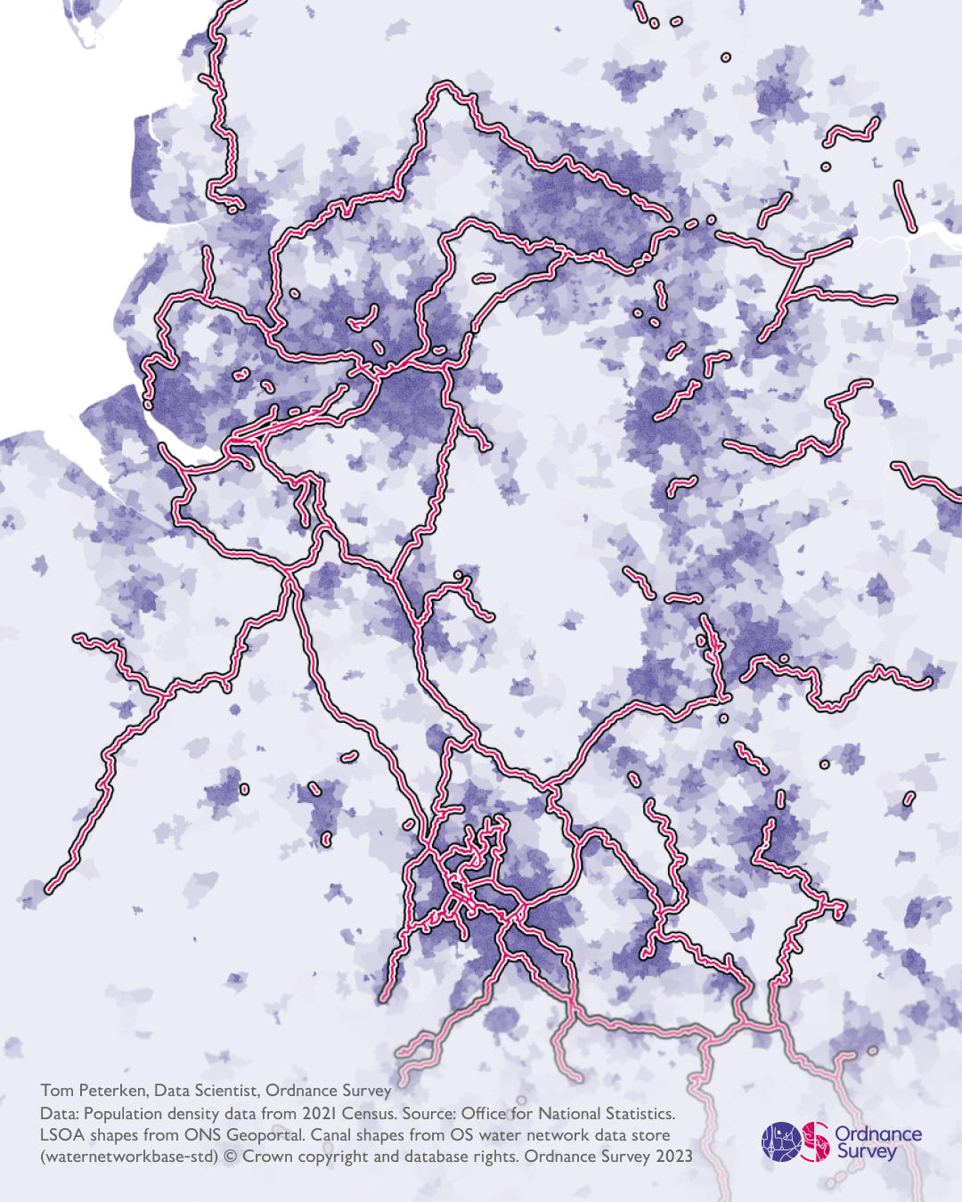
Southern Pennine Canals – Tom Peterken, Data Scientist
Until the railways arrived, navigation of heavy goods between towns was mainly via water. During the late 18th century, a canal network grew rapidly in industrialising areas to connect between the navigable rivers, helping to supply the rapidly growing cities. Many canals were known as navigations, reflecting the nautical origins of the word, and the labourers who built them known as “navvies”. This map shows the canal network around the southern Pennines, overlaid on the 2021 Census population density data, showing how the canals still connect the most populous areas today.
Day 7 - Navigation (Part 3)
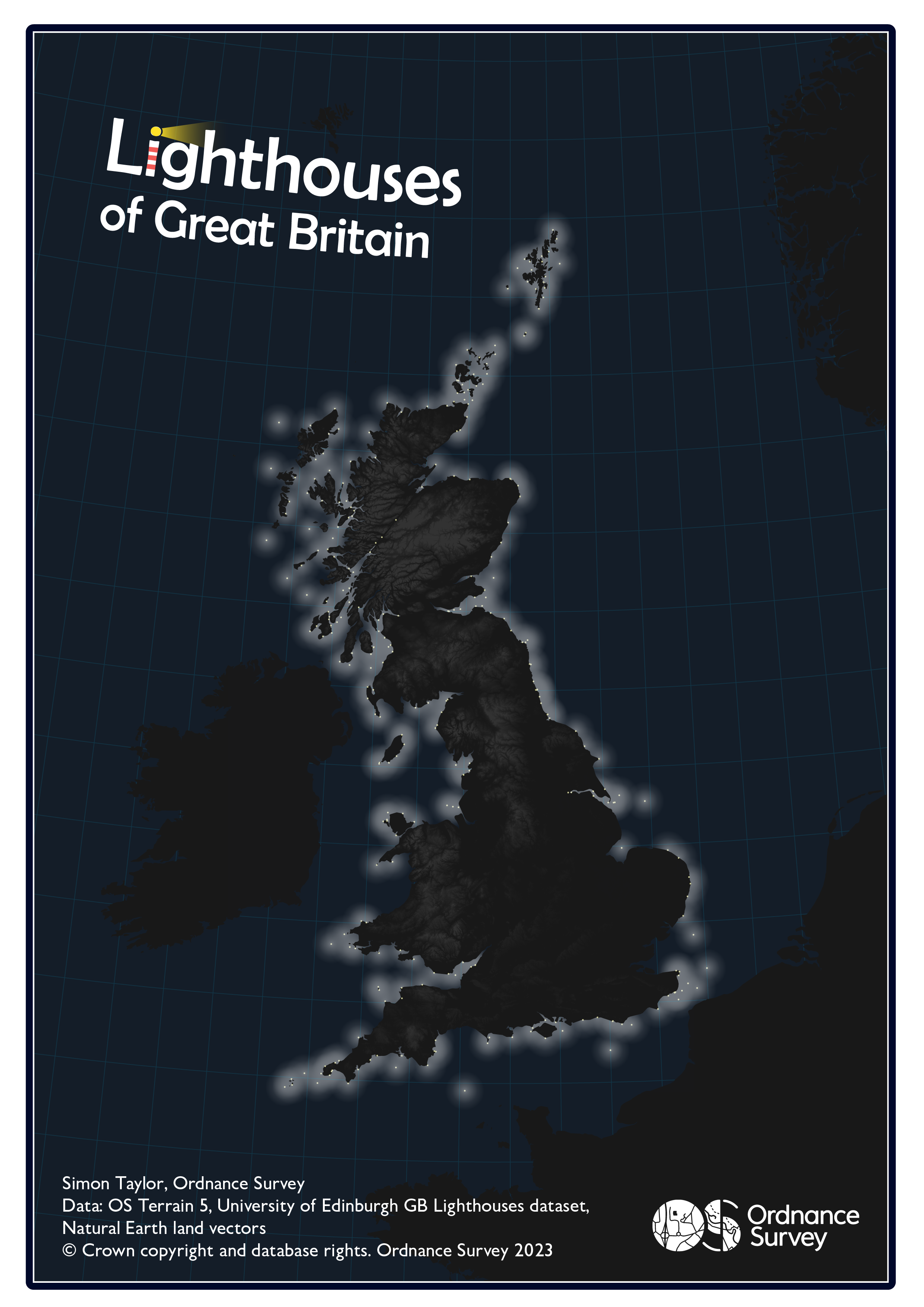
Lighthouses of Great Britain – Simon Taylor, Cartographer
This map is a simple visualisation of the active lighthouses (and lightships!) around Great Britain. Simon used a 25 mile buffer around each point, the average distance at which you can see the lighthouses, and added a white to transparent gradient to show the light emitted from each source.
Day 8 - Africa
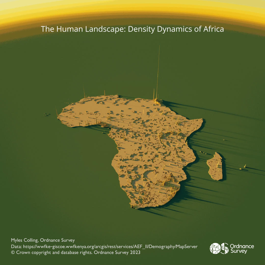
The Human Landscape: Density Dynamics of Africa – Myles Colling, Geospatial Graduate
This animated map shows the huge variations in population density across Africa. This beautiful 3D map was created using Aerialod and then turned into an animation.
Day 9 – Hexagons
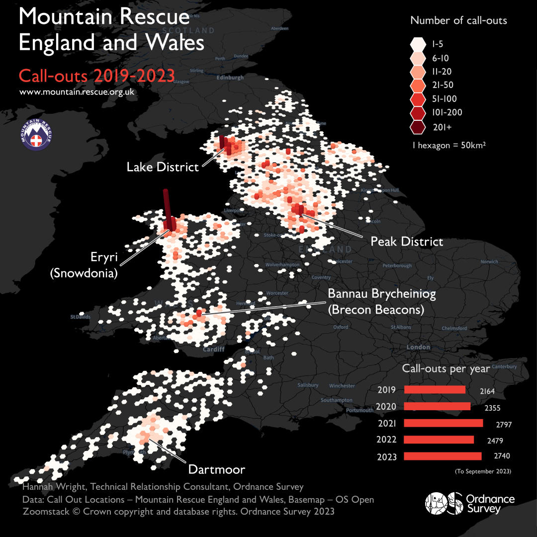
Mountain Rescue England and Wales – Hannah Wright, Technical Relationship Consultant
Created in Partnership with Mountain Rescue England and Wales (MREW), this data visualisation explores callouts attended to be MREW teams across England and Wales between January 2019 and September 2023. By adding a 3-dimensional element to the data really brings the data to life and allows you to see the callout hot-spots.
Day 10 – North America
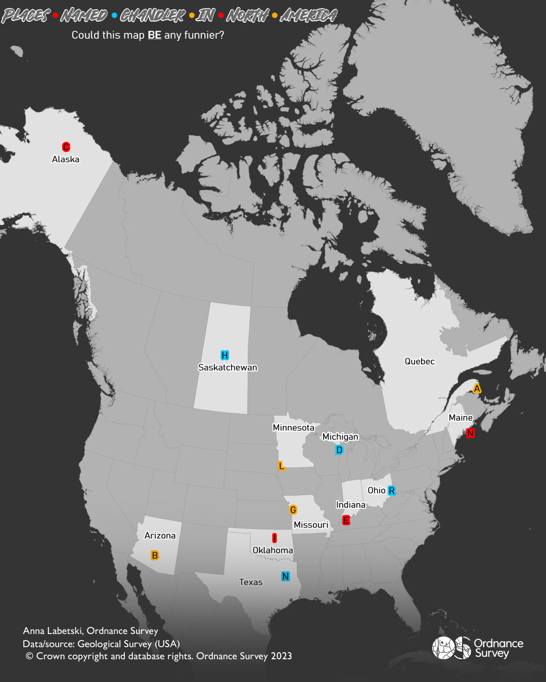
The one where we remember Matthew Perry – Anna Labetski, Data Scientist
Anna grew up Canada and said “My generation was very influenced by the show Friends. The loss of Matthew Perry has been a shock to many. Having the warm memories of the show and the role of Chandler will live on. This map is a representation of places in North America that are called Chandler. The colours are from the Friends logo. Matthew Perry is also Canadian-American.”
Day 11 – Retro
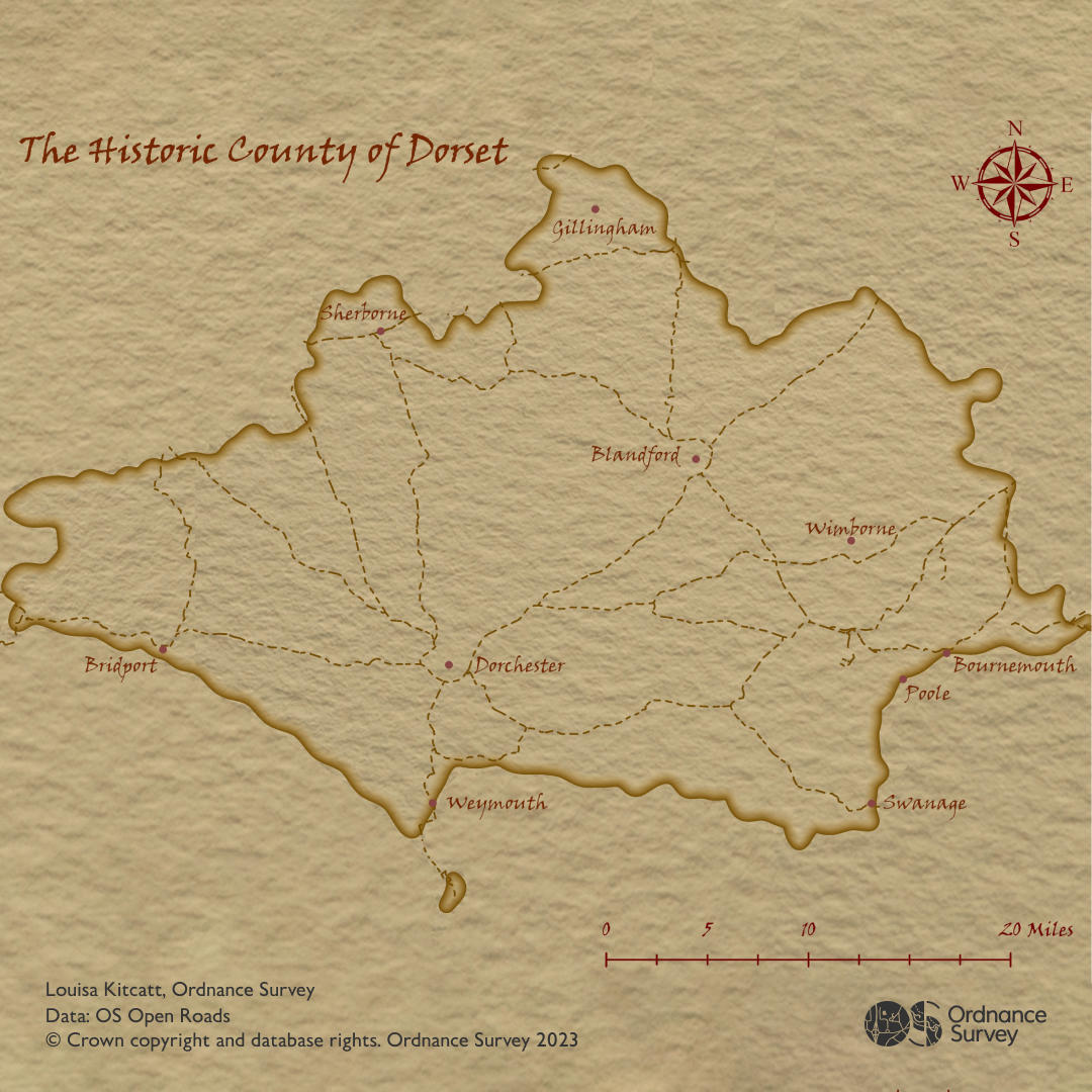
The Historic Country of Dorset – Louisa Kitcatt, Graduate
This vintage map of Dorset features old towns and a limited road network to replicate 19th/20th century Dorset. The map was created in ArcPro using tutorials from John Nelson including drop shadow and watercolour effects to recreate a vintage.
Day 12 – South America
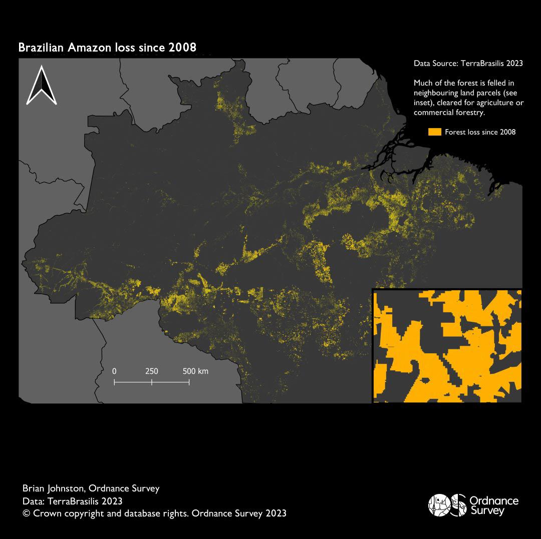
Brazilian Amazon loss since 2008 – Brian Johnston, Technical Relationship Consultant
This map brings to life just how much forest has been lost from Brazil Amazon rainforest since 2008. The inset map shows the clearance occurs in adjacent individual land parcels, cleared for agriculture or commercial forestry.
Day 13 – Choropleth
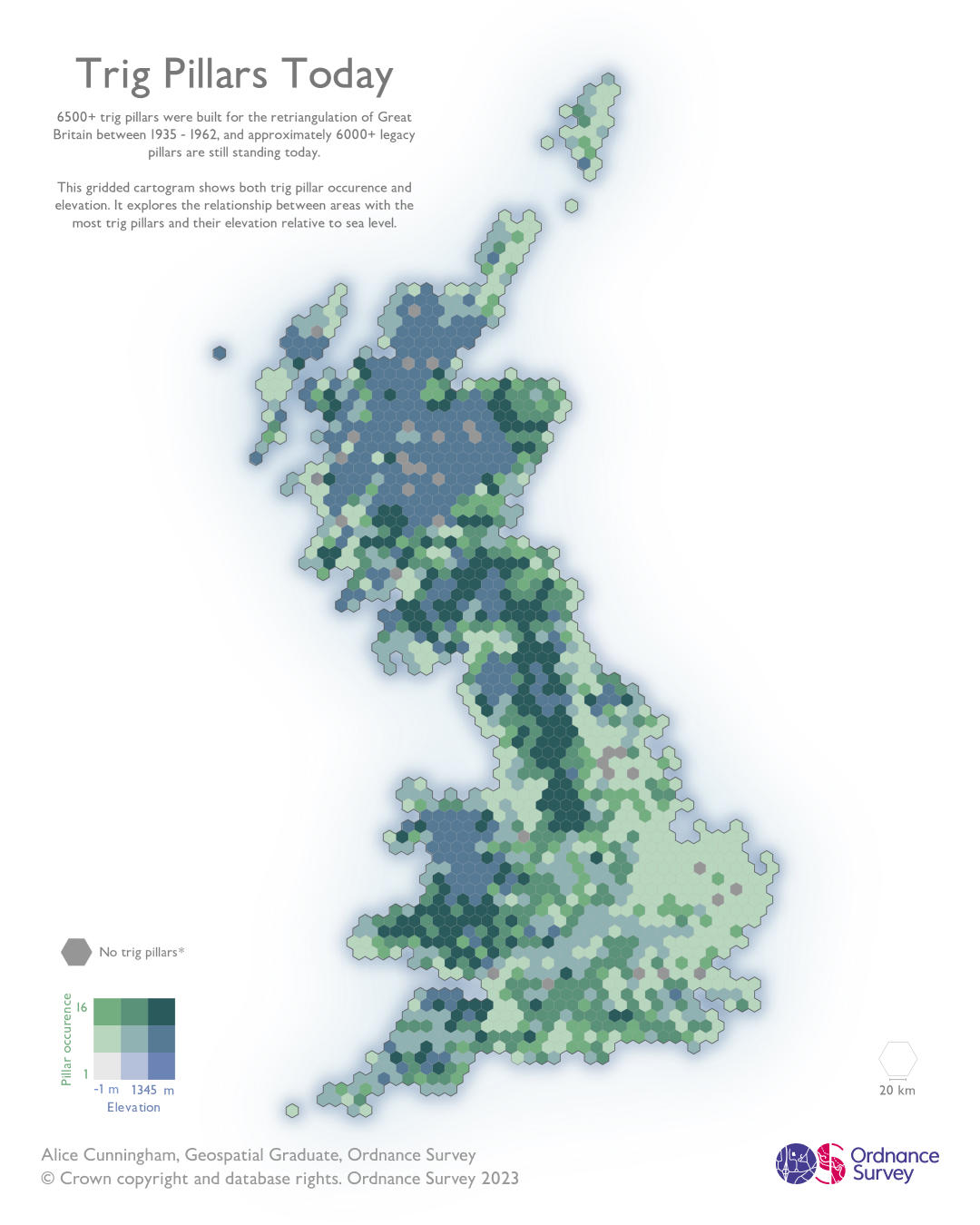
Trig Pillars Today – Alice Cunningham, Geospatial Graduate
This map is a slightly different take on the traditional choropleth map and uses a beautiful bivariate colour scheme and hex map format to visualise at the distribution and elevations of the icon Trig Pillars across Great Britain.
Day 14 - Europe
Eurovision Through the Ages – Myles Colling, Geospatial Graduate
This dataviz animation shows the host and winner(s) of every #Eurovision Song Contest from 1956 to 2023.
Day 15 – Open Street Map
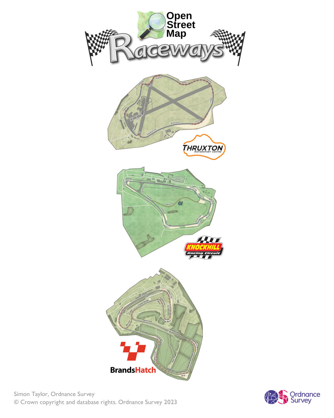
Raceways – Simon Taylor, Cartographer
Simon has used Open Street Map data to create bespoke visualisations of three iconic racetracks: Thruxton, Knockhill and Brands Hatch.
Day 16 – Oceania
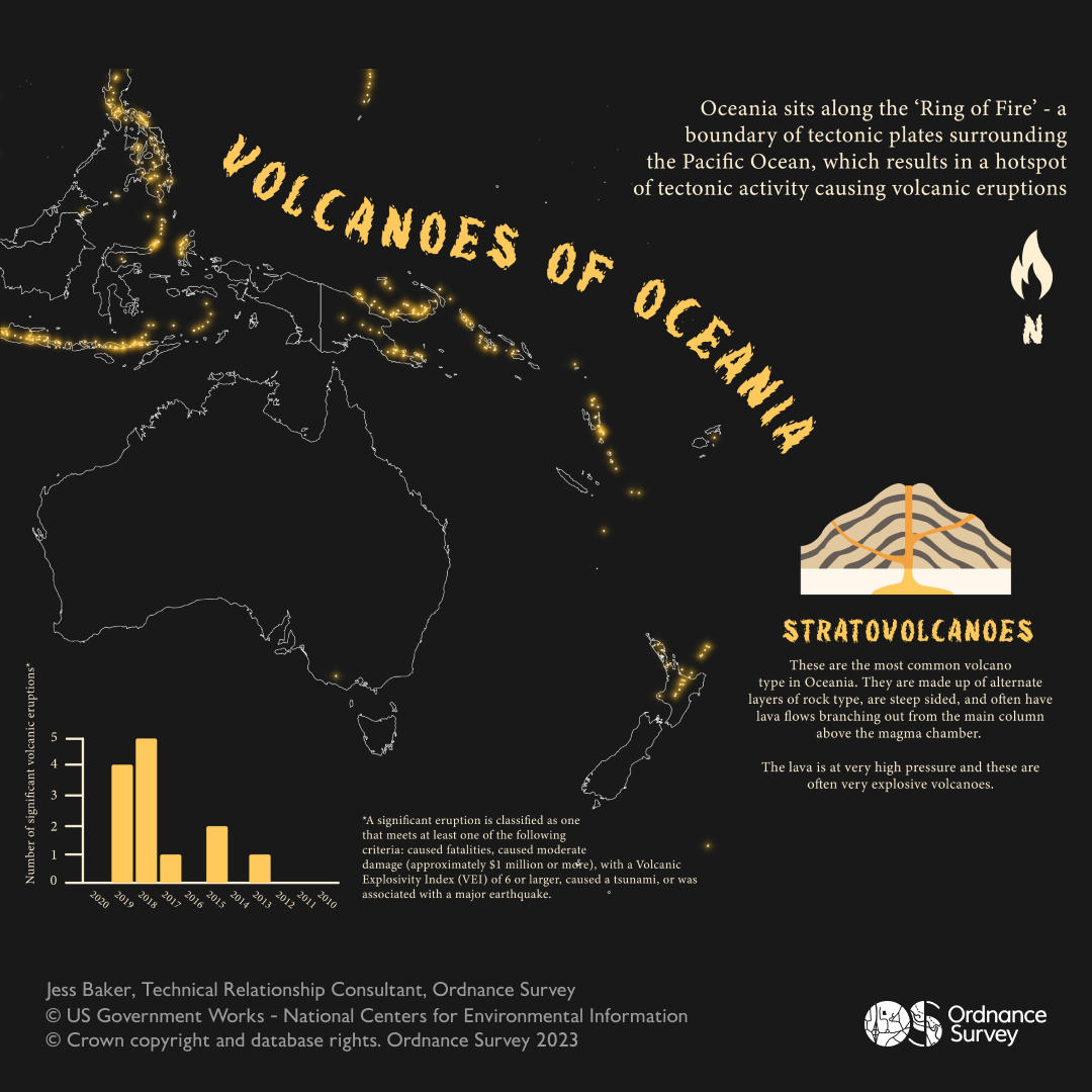
Volcanoes of Oceania – Jessica Baker, Technical Relationship Consultant
This map was inspired by the recent volcanic activity in Iceland and Italy. The data was sourced from Princeton University's 'Global GIS : volcanoes of the world' dataset, as well as the US Government's National Centres for Environmental Information 'Significant Volcanic Eruption Database'.
Day 17 – Flow (Part 1)
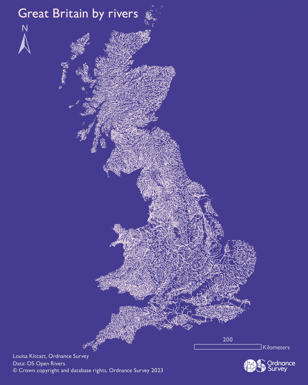
Great Britain by rivers – Louisa Kitcatt, Graduate
A very simple but effective map illustrating the national coverage of rivers across Great Britain. Using only river data, the shape of Great Britain is easily recognisable due to the high density of rivers.
Day 17 - Flow (Part 2)
Against The Flow – Richard Hargreaves, Geospatial Developer
This animation is the return migration journey of the hardy Atlantic Salmon. Described as one of the greatest journeys of the natural world, Salmon navigate across the oceans back upstream to their birth rivers to spawn. This particular little fish is making its way upstream of the Scottish River Conon, over the impressive Rogie Falls to finally spawn at Loch na Croic.
Day 18 – Atmosphere
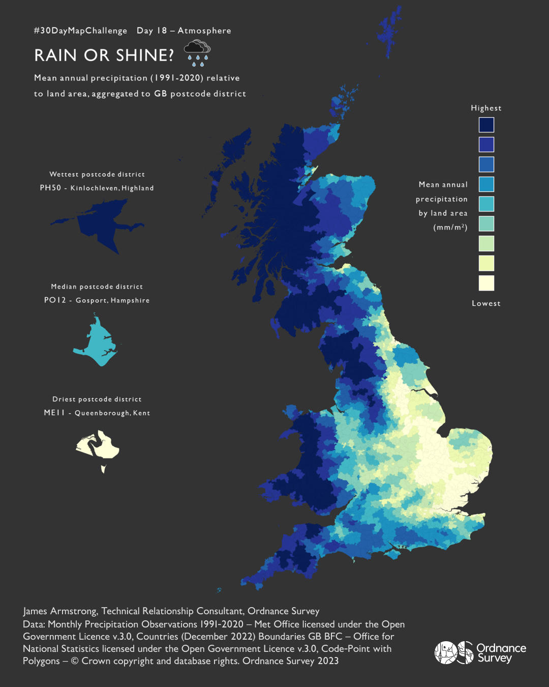
Rain or Shine – James Armstrong, Technical Relationship Consultant
A map of mean annual precipitation relative to land area, aggregated to GB postcode district. Created using QGIS & FME, using data from Ordnance Survey, Met Office, and Office for National Statistics.
Day 19 – 5-minute map
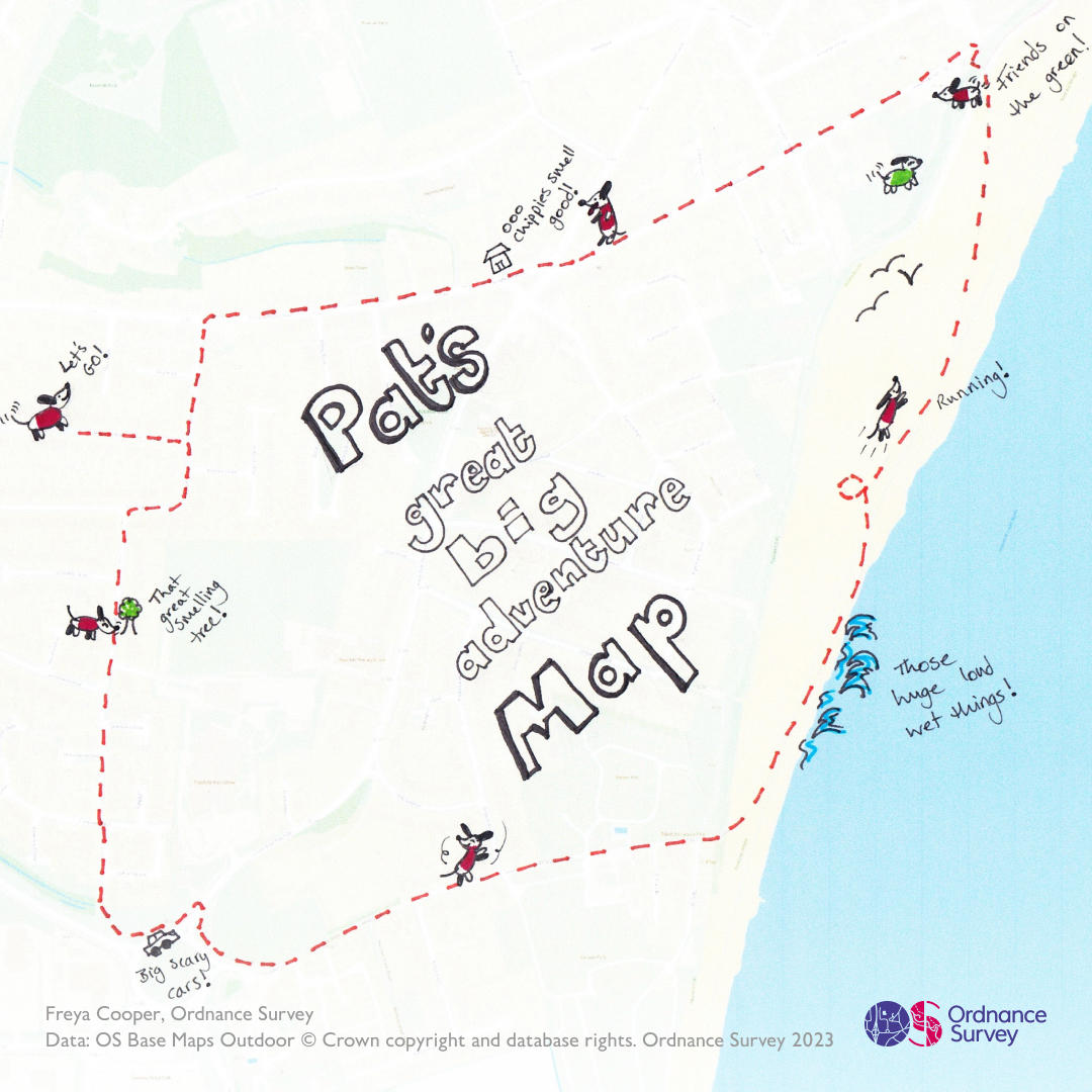
Pat’s great big adventure map – Freya Cooper, Data Management Analyst
This is the beach walk route of Freya’s 5-month-old dachshund puppy, Pat. Pat being very small means that everything is a great big adventure and every time they head to the beach he has a whale of a time!
Day 20 – Outdoors (Part 1)
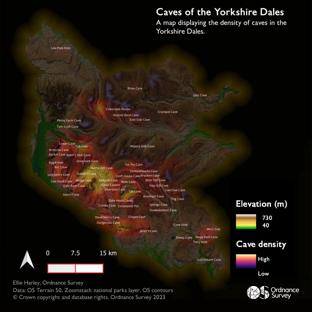
Caves of the Yorkshire Dales - Ellie Harley, Graduate
A map showing the density of current caves across the Yorkshire Dales National Park. This uses OS Terrain 50, OS Open Zoomstack and caves selected from the landforms feature type of the National Geographic Database.
Day 20 - Outdoors (Part 2)
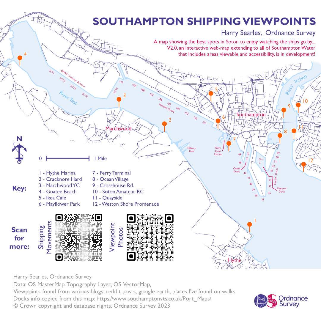
Southampton Shipping Viewpoints – Harry Searles, Graduate
A map that shows the best spots to view ships on the Southampton Water around Southampton. The viewpoints were sourced by Harry from blogs, maps and his own exploration.
Day 20 - Outdoors (Part 3)
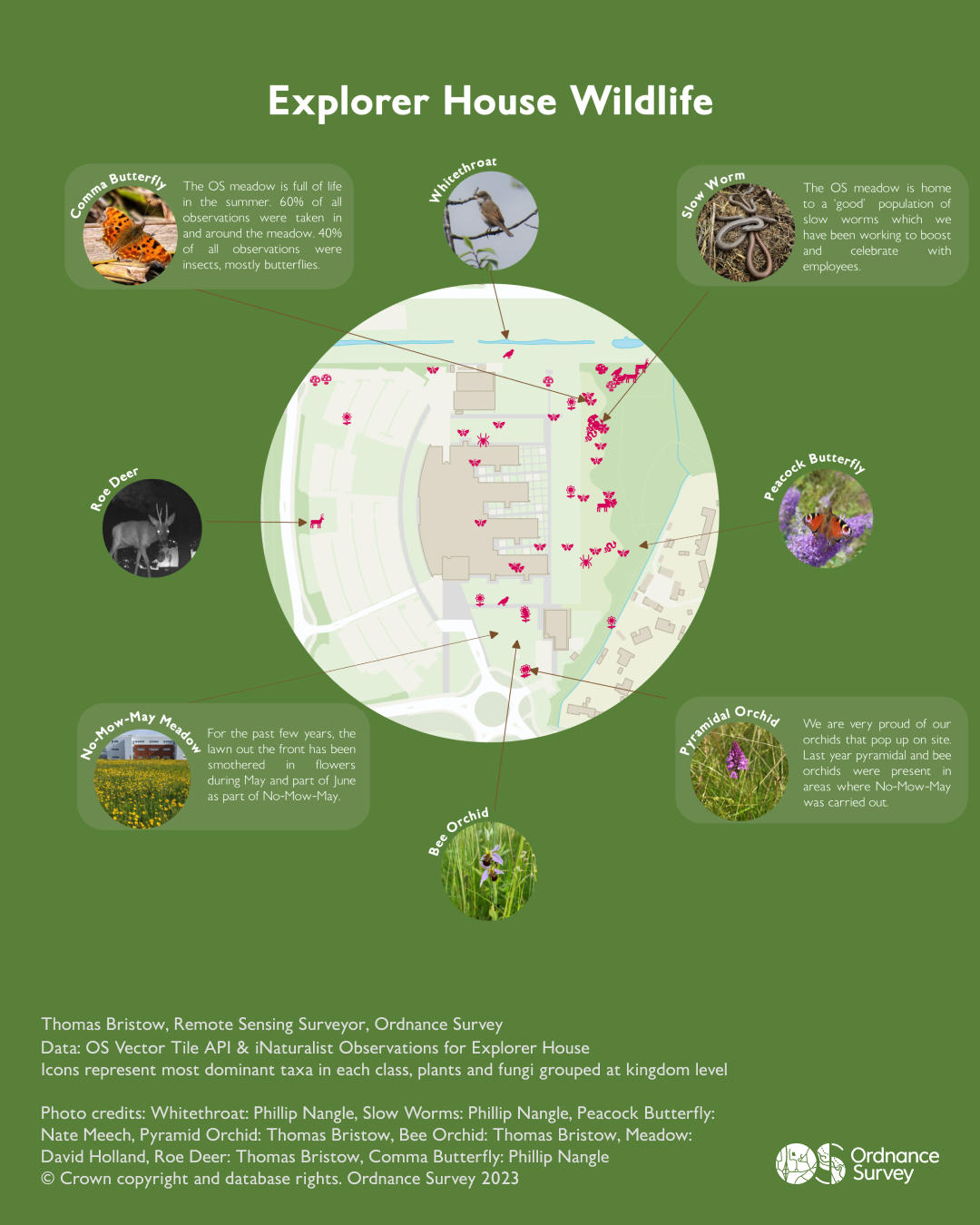
Explorer House Wildlife – Thomas Bristow, Remote Sensing Surveyor
As part of wider Ordnance Survey biodiversity work, we have created a project on the platform Naturalist to promote engagement and citizen led monitoring related to wildlife at Explorer House. Since its release earlier this year over 60 observations have been made comprising 42 different species. To celebrate this we created this map of observations with some of the best photos of wildlife spotted on site.
Day 21 – Raster
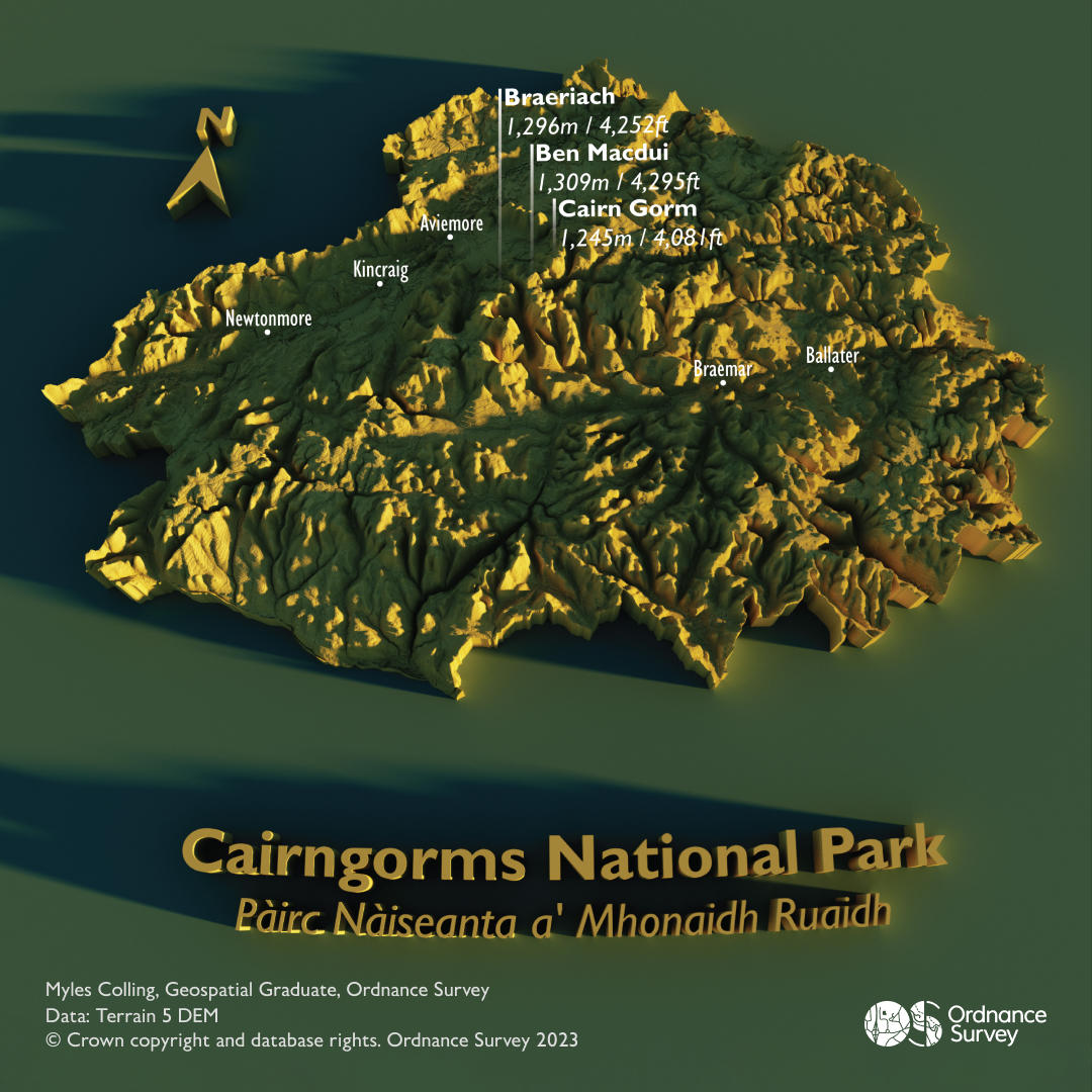
The Cairngorms National Park – Myles Colling, Geospatial Graduate
This eye catching visual was created to celebrate the Cairngorms National Park which had it’s 20th anniversary this year. The visual was created in Aerialod using OS Terrain 5 data.
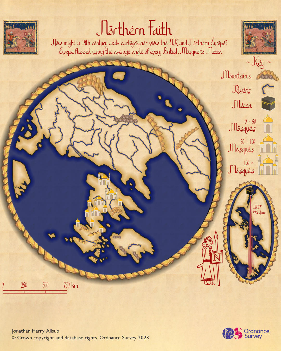
Day 22 – North is not always up (Part 1)
Northern Faith – Jonathan Allsup, Graduate
This map was inspired by the Arabic cartographer Muhammad Al Idrisi who created some of the first maps of Europe in the 1400s. Culturally Arabic historians saw north as the direction of Mecca, so this map flips the UK and northern Europe based on the average angle of every mosque in the OS NGD landuse theme, landuse feature to Mecca. The map is also designed using traditional Arabic artwork as a guide, with custom symbology to denote the presence of Mosques on the UK mainland. The mosque and Mecca graphic designed by Graduate Harry Searles.
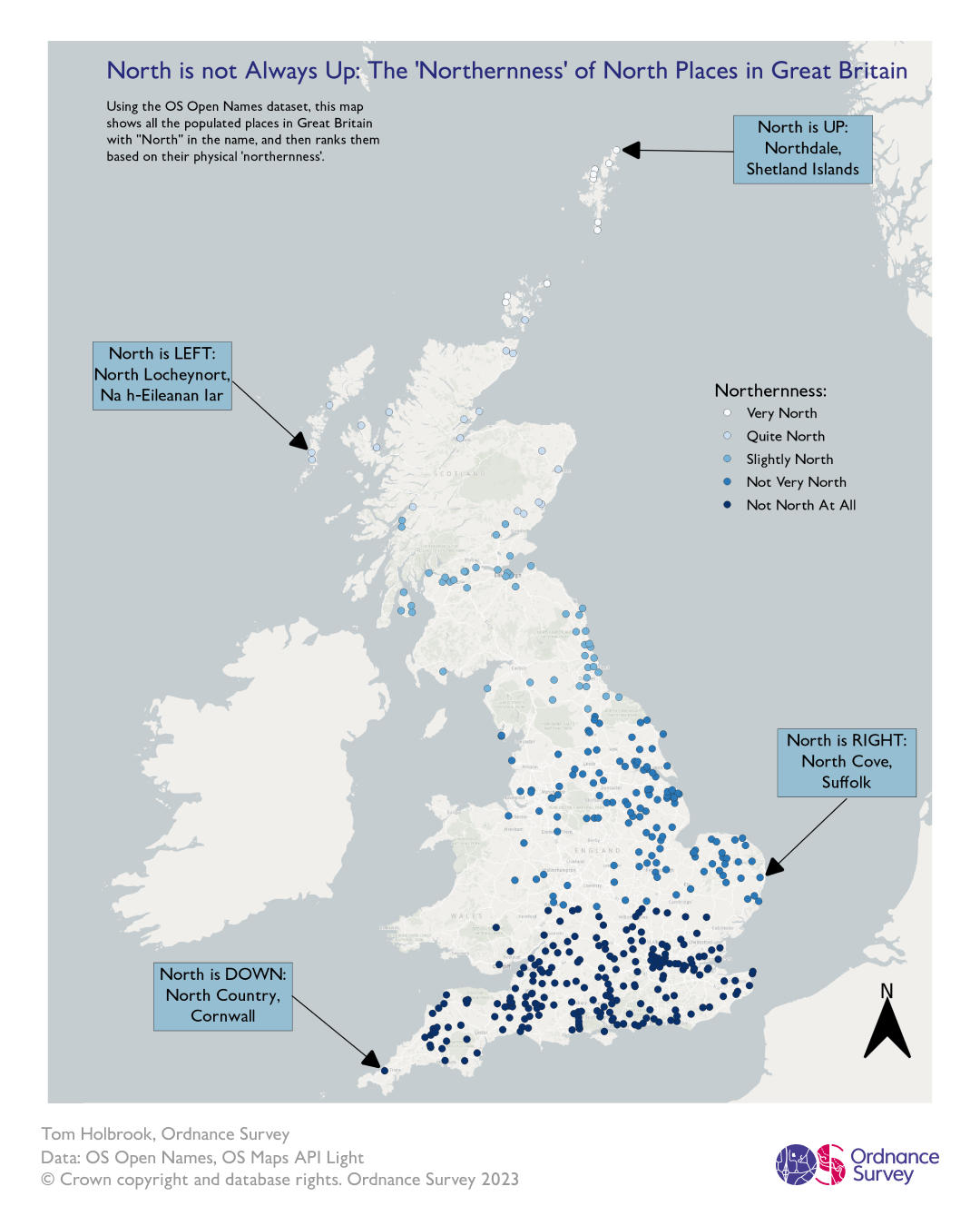
Day 22 - North is not always up (Part 2)
The ‘Northernness’ of North Places in Great Britain - Thomas Holbrook, Geospatial Graduate
The map shows the location of all the places in Open Names with ‘North’ in the name. It then has a graduated colour scheme to rank how far north in Great Britain they are. It highlights the furthest north, south, east and west places as the places where north is up (north), down (south), left (east) and right (west).
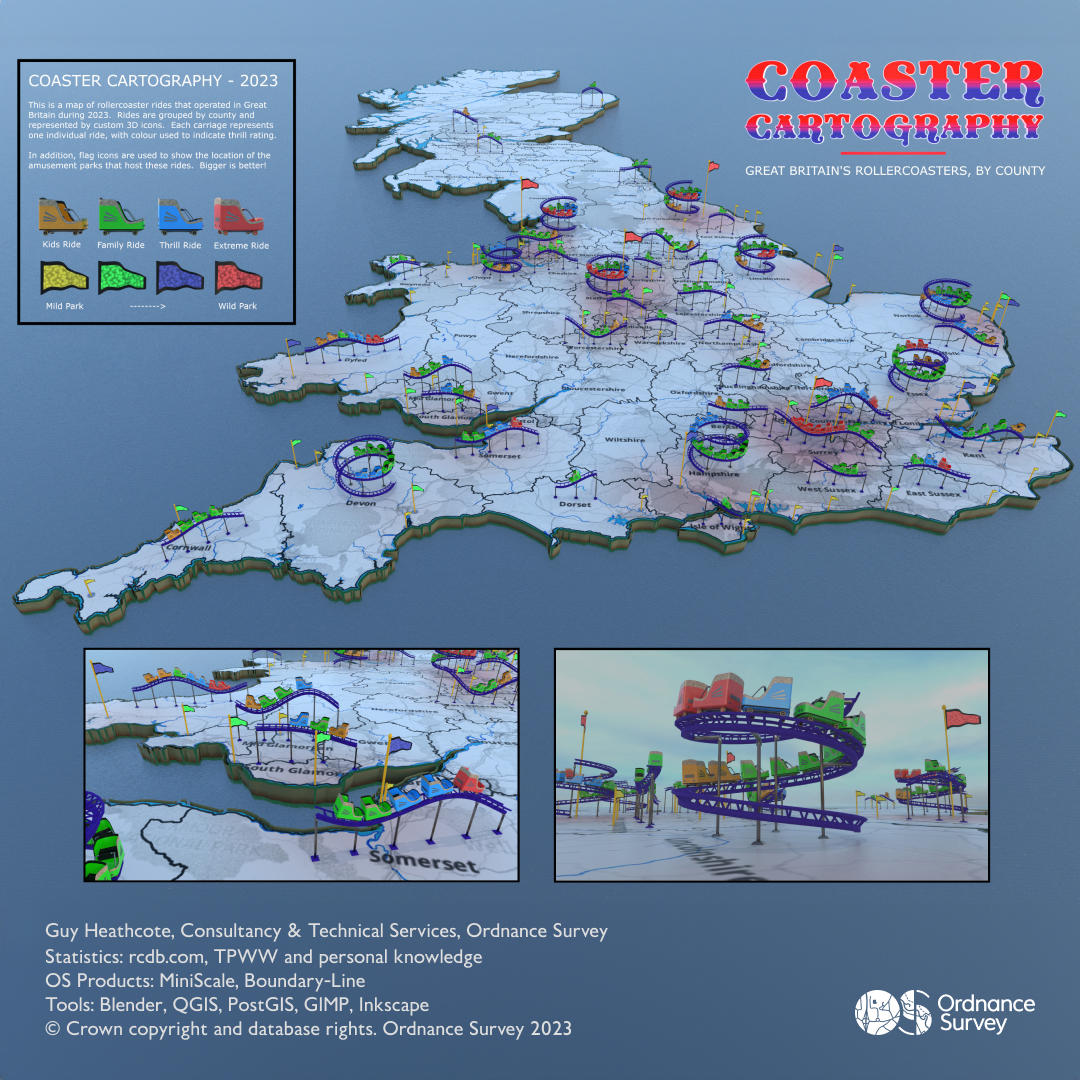
Day 23 – 3D (Part 1)
Coaster Cartography – Guy Heathcote, Product Development Consultant
Guy’s map shows the fixed-location rollercoaster rides that operated in Great Britain during 2023. Rides are grouped by county and represented by custom 3D rollercoaster icons. Each carriage represents one individual ride, with colour used to indicate thrill rating. Further to this, flag icons are used to show the location of the amusement parks that host these rides. Finally, a subtle heat map has been included, highlighting which areas of the country are likely to be of most interest to potential thrill seekers!

Day 23 - 3D (Part 2)
The Bathymetry of the Lake District National Park – Mel Marochov, Associate Data Scientist
The bathymetry (depth) of lakes in the Lake District. You can view even more lakes in the interactive version at www.lakelochlove.co.uk.
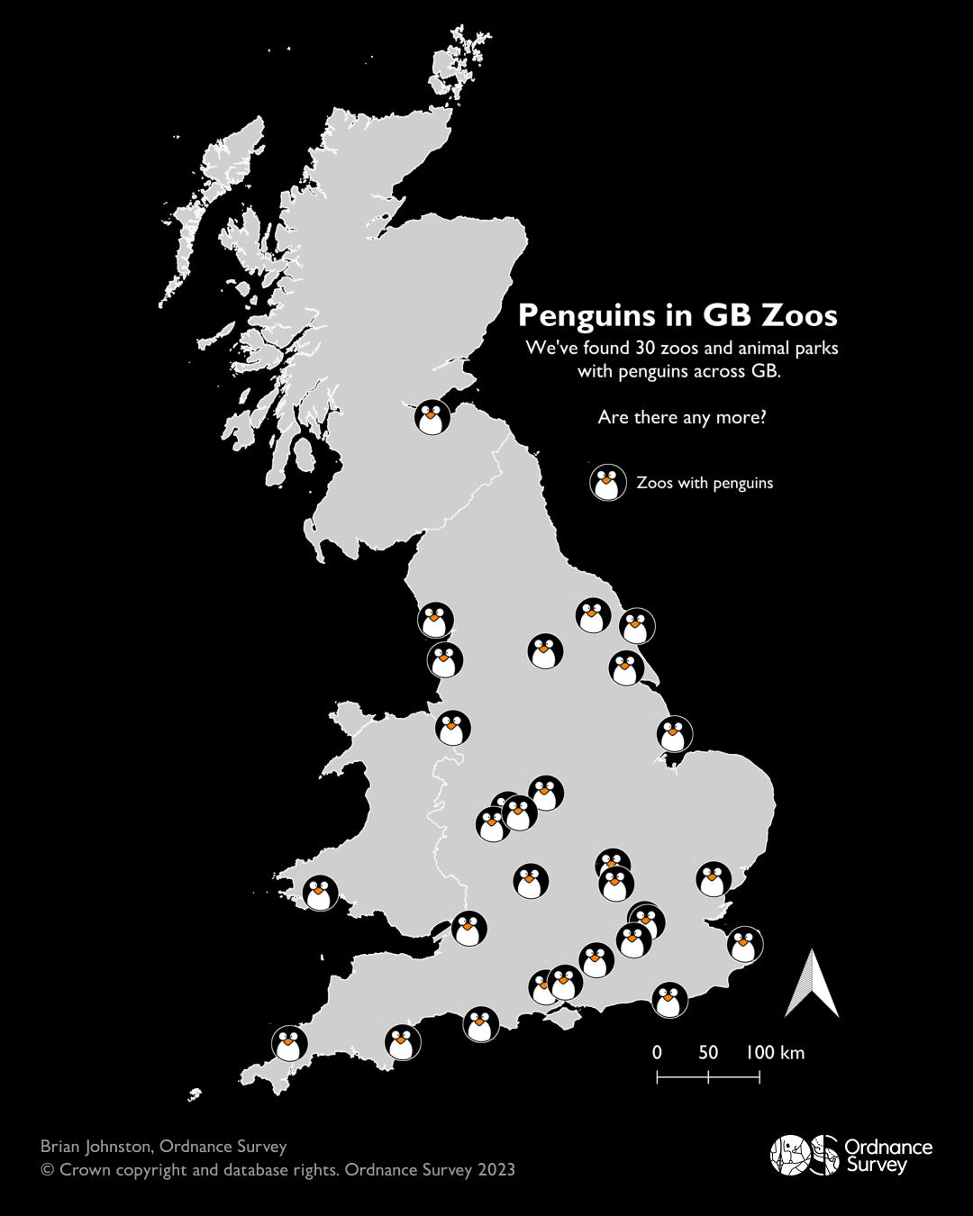
Day 24 – Black and White
Penguins in Great British Zoos - Brian Johnston, Technical Relationship Consultant
Who doesn’t want to know where their nearest penguin is? Brian Johnston explores the penguin populations in Great Britain.
Day 25 – Antarctica
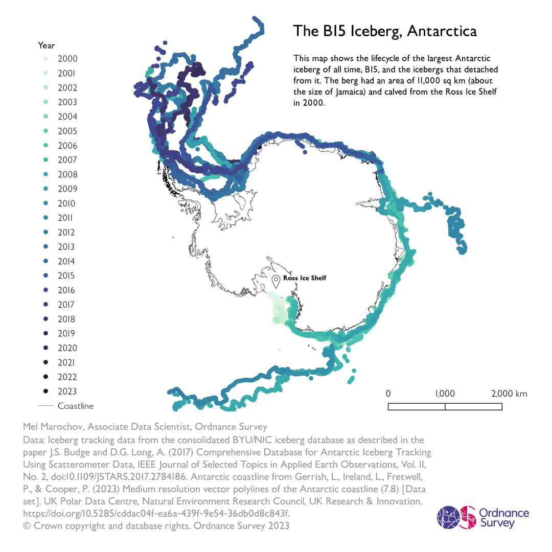
The B15 Iceberg – Mel Marochov, Associate Data Scientist
This map shows the lifecycle of the largest Antarctic iceberg of all time, B15, and the icebergs that detached from it. The berg had an area of 11,000 km2 (about the size of Jamaica) and calved from the Ross Ice Shelf in 2000.
Day 26 – Minimal (Part 1)
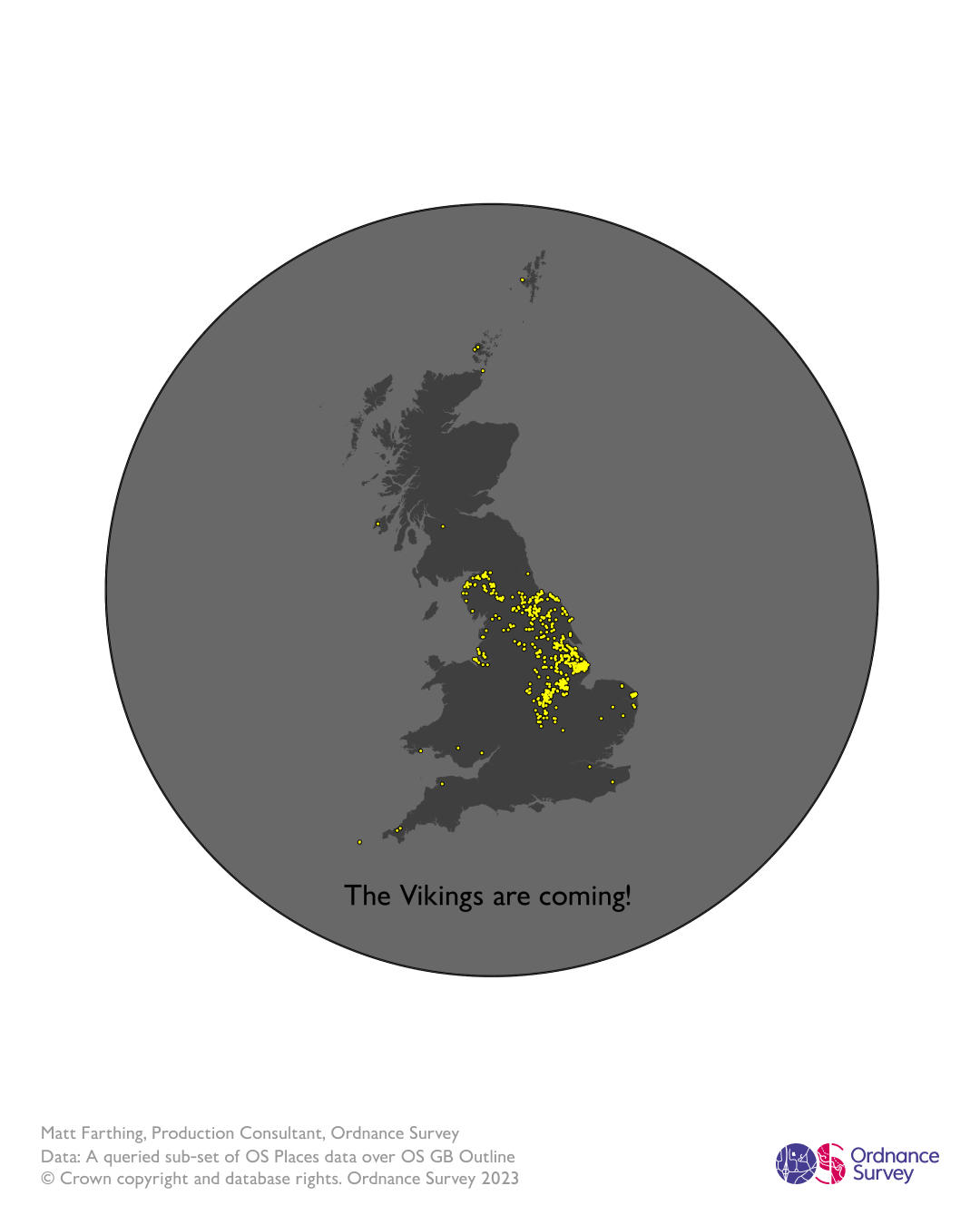
The Vikings are coming – Matt Farthing, Production Consultant
Growing up in Lincolnshire, Matt thought that that half of all place names ended “…by”, but no, it turns out it’s a Viking thing! The correlation between “by” as a suffix for a place name (meaning “hamlet”), and Norse settlement over the millennia, is, if not a guarantee, at least a very strong indication. He can’t be sure that they ever made it to Tenby though…
Day 26 – Minimal (Part 2)
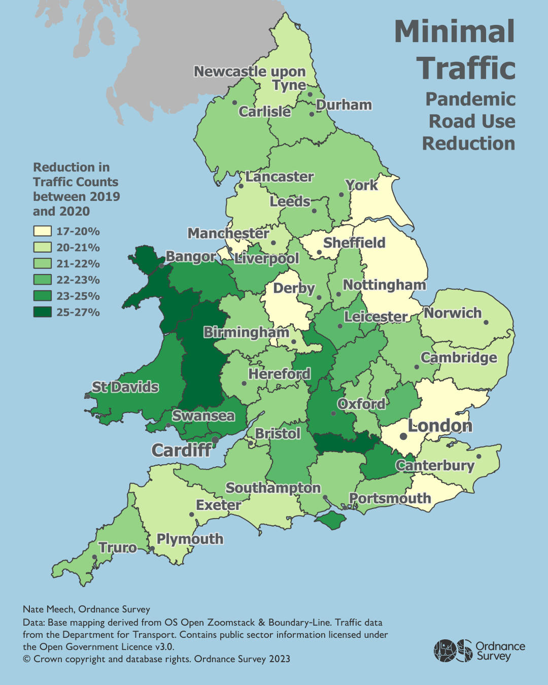
Minimal Traffic – Nate Meech, Associate Data Architect
A map representing the percentage decline in road use between 2019 and 2020 by ceremonial county. The fact that the max reduction is <27% shows how quickly things bounced back in 2020 given how much greater the decrease must have been during lockdowns.
Day 27 – Dot
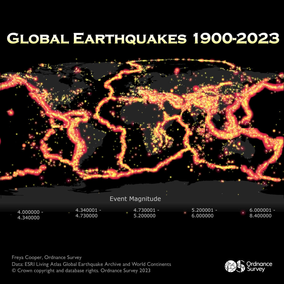
Global Earthquakes – Freya Cooper, Data Management Analyst
This is a dot density and graded symbol map of global earthquakes from 1900 to November 2023. It highlights the tectonic plate boundaries across the globe and shows the areas with the highest rates of large magnitude quakes.

Day 28 – Is this a chart or a map? (Part 1)
Is this a chart or a map? – Douglas Leno, Data and Technology Graduate
A common point of discussion, what defines a map – what do you think? Are these maps or charts? These visuals depict the topography of Great Britain’s three highest mountains: Ben Nevis, Snowdon and Scafell Pike.
Day 28 – Is this a chart or a map? (Part 2)
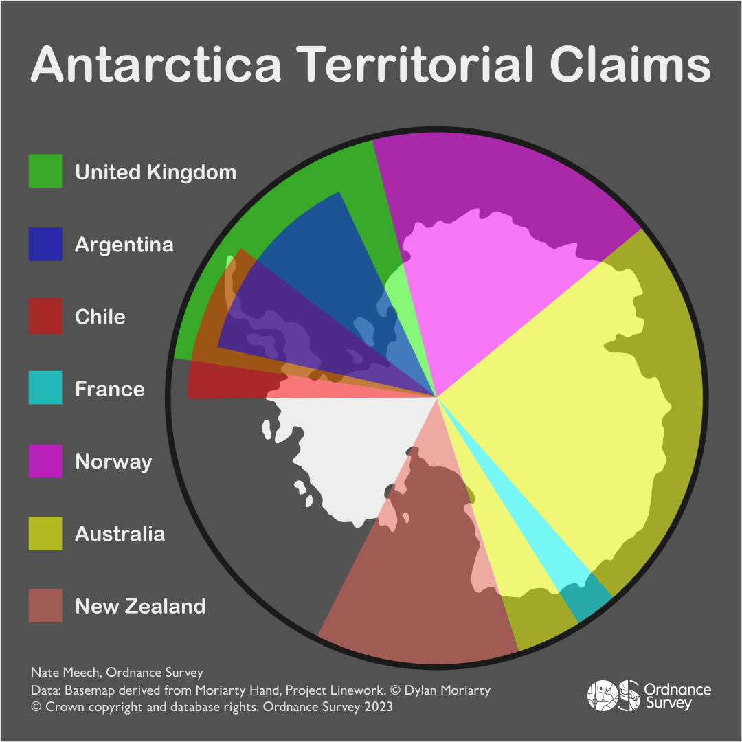
Antarctica Territorial Claims – Nate Meech, Associate Data Architect
Is this a map or a chart? You could argue it's doing a poor job of being either, or you could think that they are not mutually exclusive and it straddles the two as a simple diagrammatic representation of data that happens to be geospatial in nature.
Day 29 – Population
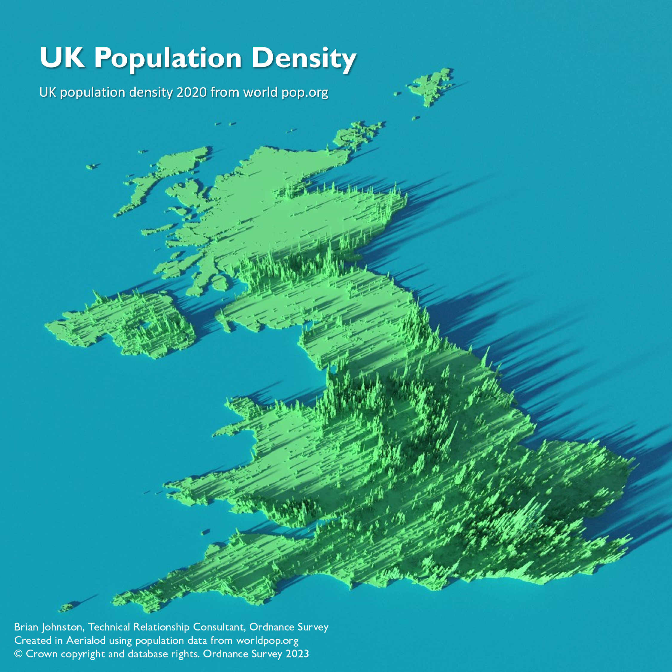
UK Population Density – Brian Johnston, Technical Relationship Consultant
An intriguing 3D visualisation of the population density of the United Kingdom, created using Aerialod.

Day 30 – “My favourite..”
Precious Places – Paul Naylor, Technical Relationship Consultant
Where’s your precious place? Maybe it’s a sunrise spot on your favourite summit or a peaceful park bench in your local town. It might be a place that provides a daily dose of fresh air, or somewhere you’ve enjoyed special holidays. Perhaps a location steeped in precious childhood memories?
Precious places near and far, provide experiences for so many of us and help us make lasting memories outdoors. As part of National #GetOutsideDay 2023, we asked the nation to tell us about their favourite place to encourage people to find and discover somewhere new. We also asked some of our friends in the outdoor industry to share with us their top places to get outside.
This map shows a snapshot of the nation's favourite places! Is yours in there?
Custom Made Maps
Treat all your senses with Custom Made Maps from OS

Our highly accurate geospatial data and printed maps help individuals, governments and companies to understand the world, both in Britain and overseas.