Ordnance Survey’s favourite maps of 2023
Data continues to be visualised in traditional and new, innovative ways and every year we are treated to a plethora of amazing maps and interesting visualisations.
OS's GeoDataViz team would love to share those maps and data visualisations that really stood out and caught their eye.
So make yourself a cup of tea, put your feet up and enjoy some of our favourites from 2023.
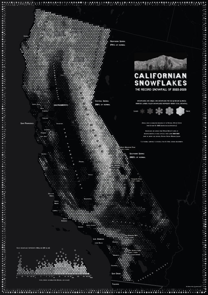
Californian Snowflakes – Ken Field
This beautiful monochrome map from Esri cartographer Ken Field is super cool.
The map depicts California’s record 2022-23 snowfall and was inspired by a meteorologist called Wilson Bentley who was famous for his microphotographs of individual snowflakes and a map from the United States Geological Survey Data Science team. It's based on a traditional 'hexbin' map but Ken used snowflakes instead of hexagons and chose some unique snowflake designs to depict the total snowfall.
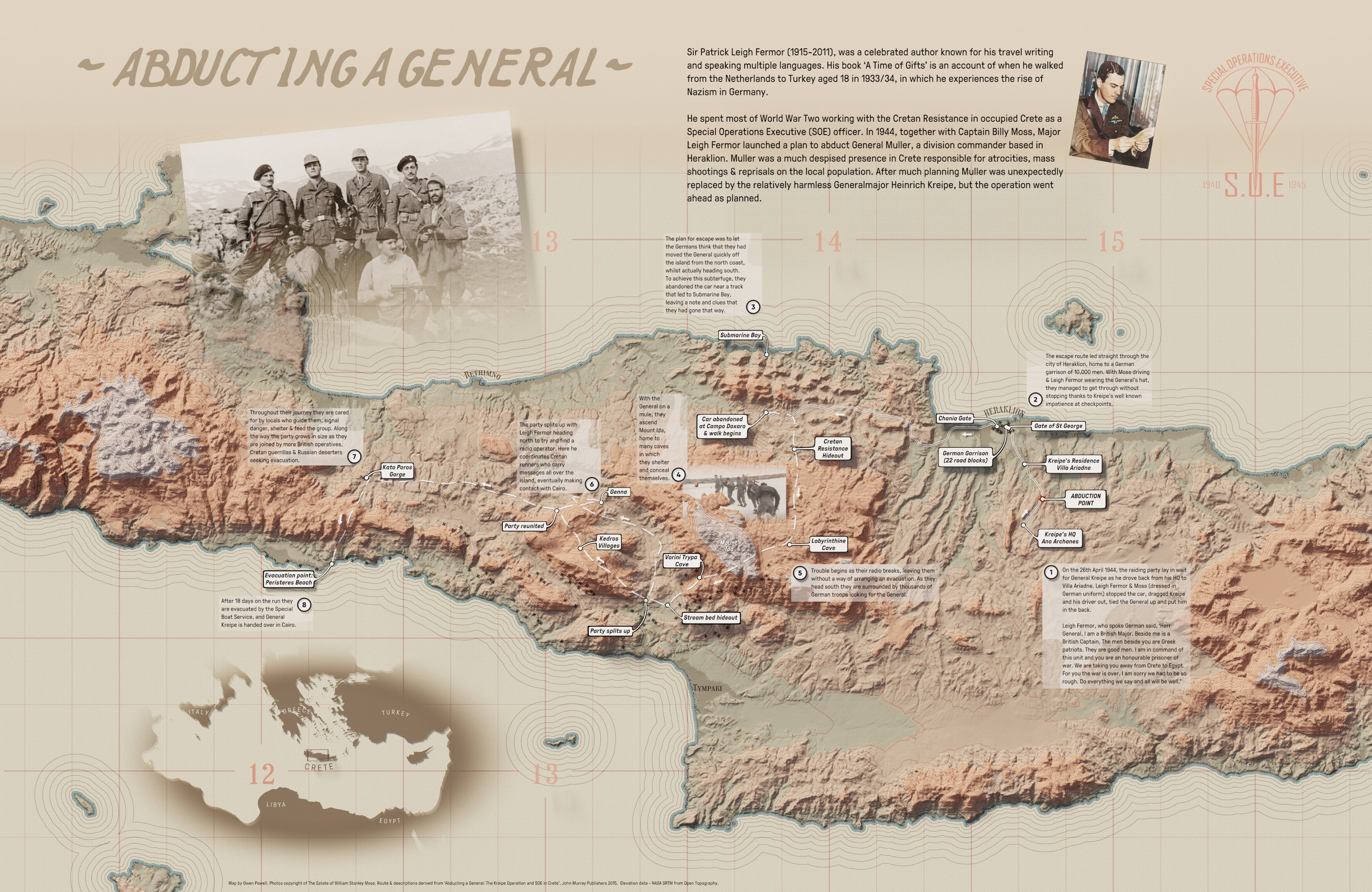
Abducting a General – Owen Powell
We stumbled across this map via X (Twitter) and we really love some of the different cartographic design techniques used to tell the story about the World War Two abduction of General Major Heinrich Kreipe.
The map has a beautiful colour palette reminiscent of the era and the subtle annotation leads us around a journey from abduction to evacuation. The map highlights the rugged and varied terrain of the island via some contours and hill shade and the coastline is reminiscent of a John Nelson style. It’s a great map that is well worth a closer look!
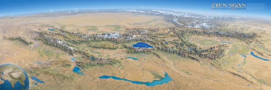
Tien Shan – Erik Knight
Eric Knight makes some of the best relief and panoramic maps there is.
This one of the vast Tien Shan mountain range in Central Asia is no exception. The cartographic design is exquisite and the detail second to none. The more you are look at it the more real it starts to appear.
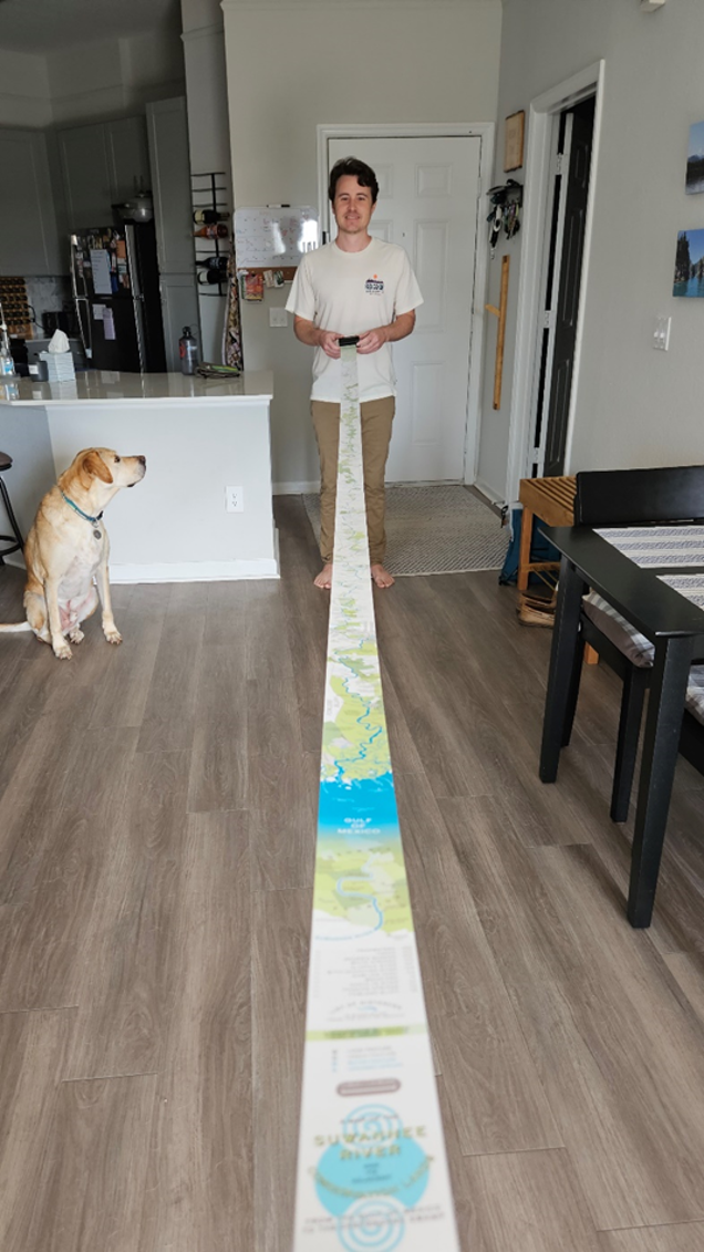
Suwannee Ribbon Map - Aaron Koelker
This extraordinary map measures 2.5 inches by 12 feet, showing the Suwannee River and adjacent conservation lands. It draws inspiration from 19th century ‘ribbon maps’ and has such incredible attention to detail despite being so huge! We were lucky enough to see the map in real life at the British Cartographic Society’s annual conference in September 2023.
Mapping Diversity – OBC Transeuropa
This web map has to be viewed yourself to truly appreciate the time and quantity of data behind it. It uses OpenStreetMap data to show the diversity and representation – or sometimes lack of - in street names across Europe. For example, across the 17 countries showcased in the web map, more than 90% of streets named after individuals are named after white men. Not only does it highlight some easy to overlook trends in the data, but the web map itself is beautifully designed, earning it a spot as one of our favourite maps of the year.
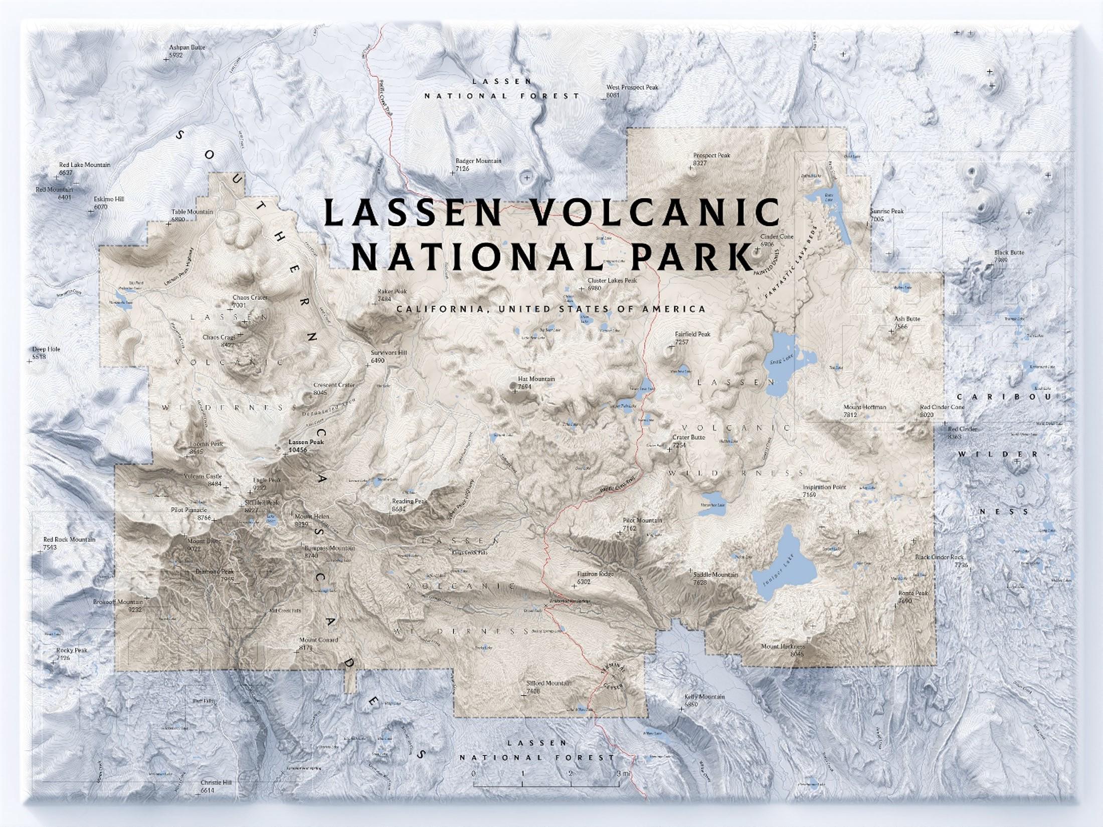
Lassen Volcanic National Park - Markku (@verygoodmaps)
Inspired by old National Geographic maps, this beautiful piece of cartography shows a volcanic national park in California. It uses colour very well, keeping to a small but complementary colour scheme to draw the eye in and we can easily see how you could spend a long chunk of time getting lost in all of the incredible detail of the map.
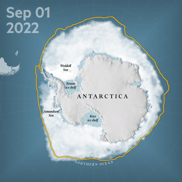
Stephen Bernard - Antarctic Sea Ice Animation
This very simple and effective animation from the Financial Times maps the changing extent of Antarctic sea ice from September 2022 to September 2023 in relation to historic ice margins. We love its simplicity using a limited colour pallet for the basemap and then brighter hues to highlight certain features. The labels add meaning to the visualisation and the message of the visual is communicated effectively without visual clutter.
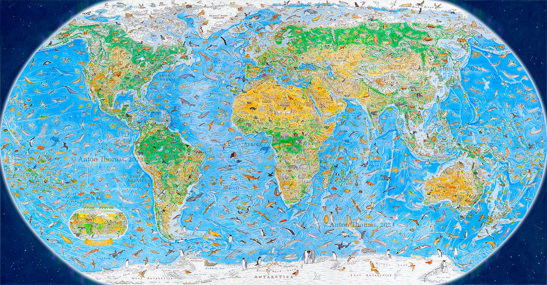
Wild World – Anton Thomas
This beautiful hand-drawn map was created by Anton Thomas over the course of the 3 years between July 2020 and July 2023. It includes intricate illustrations of 1,642 animals in the geographical location where they are found. The intense level of detail and the vivid colours make the map just so engaging to look at.
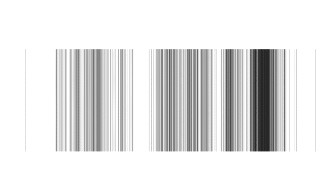
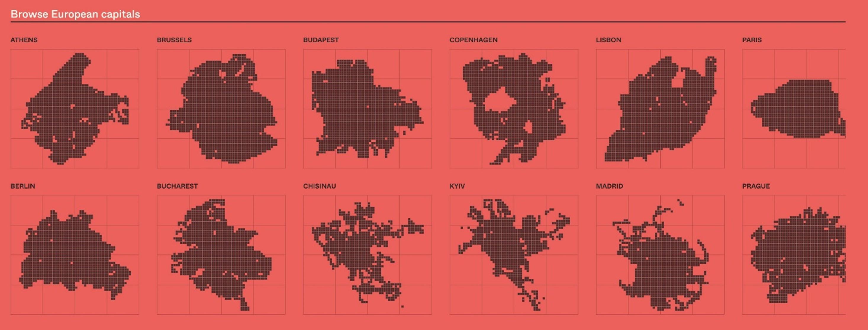
Barcode - Alasdair Rae
The #30DayMapChallenge always throws up a couple of real gems each year and 2023 was no exception. There are too many to include them all so we have chosen something a little different and gone for this minimalistic map from Alasdair Rae which was made for Day 26 – Minimal. This barcode map of world cities depicts all those cities whose population is over 500,000 via a vertical line as per their longitude. Simples.

Our highly accurate geospatial data and printed maps help individuals, governments and companies to understand the world, both in Britain and overseas.