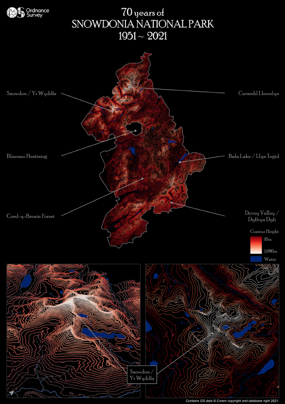
Celebrating 70 years of Snowdonia National Park
Beautiful new data visualisations of Snowdonia have been produced by OS
This year we are celebrating 70 years of some of our amazing National Parks and to help mark this milestone, Ordnance Survey has been visualising these beautiful places using a variety of different techniques. The inspiration for this map came from an Esri UK blog that focused on using contours and I liked the idea of visualising Snowdonia National Park in a similar way as it would accentuate the amazing natural features that make up the park (lakes, valleys and peaks).
All of the data used for the map is open and comes from OS Open Zoomstack as it contains a number of useful layers such as contours, national parks, names, surface water, and water lines. I downloaded the dataset in a GeoPackage format from the OS Data Hub, and also obtained a copy of themes from the OS GitHub site to help with styling. It can be accessed via the OS Flickr page.
Step 1: 2D Contours
The main focal point, Snowdonia National Park, was filtered from the National Parks layer, with the boundary then used to clip the contour, water and name features.
The contour layer contains features that are attributed as either ‘index’ or ‘normal’ – the normal contours being 10m, 20m, 30m etc. with the index contours being 50m, 100m, 150m etc. Each element on the final output contains a mixture of these features:
- Snowdonia National Park = all index and normal contours
- Snowdon 2D: index contours only
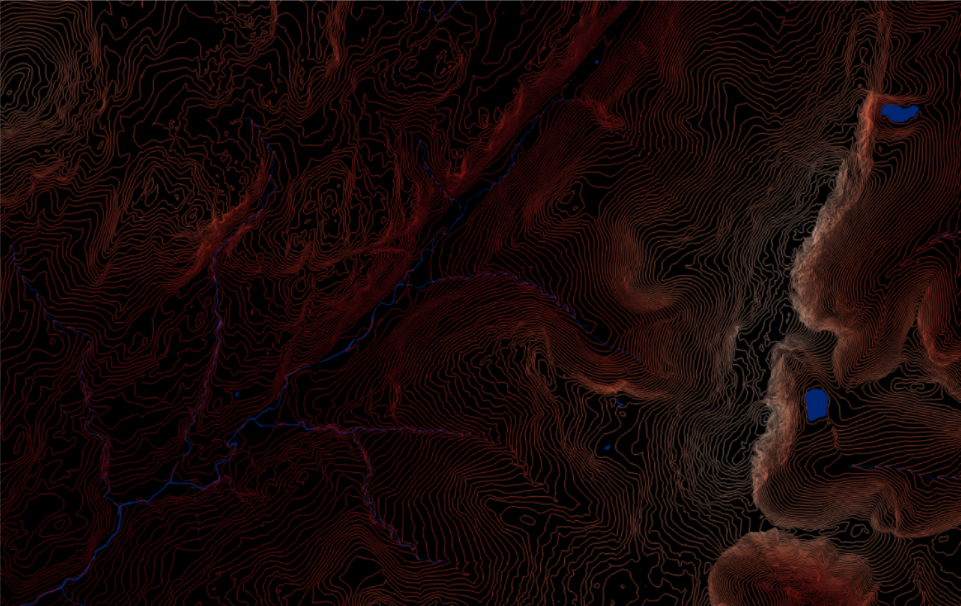
- Snowdon 3D: a selection of normal and index contours
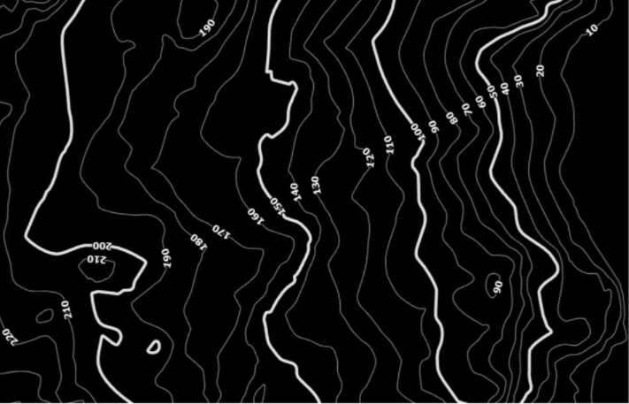
The line thickness of the contours was also experimented with, and I particularly liked the ‘sketch’ like feel using the smallest width possible (0.1) when viewed at the national park level. Colour also plays a major part with the visualisation, and I found most schemes worked well in creating dynamic lines that popped out from the dark background. However, the colour most associated with Wales was chosen for the final map…red!

Next up were the water features, and I played about with how much information was on display in regards to the ‘local’ and ‘regional’ settings in each layer, deciding on local surface water and regional water lines. I felt this helped to explain the dark areas of the map that contained limited or no contour lines, which would be the valleys, rivers and lakes.
Step 2: 3D Contours
As mentioned at the start, the inspiration for the map came from Wes Jones’ Esri blog post and I wanted to see if I could include a 3D contour map in a similar style. My original design was to create a 3D contour map of the whole national park, but it was clear early on that the technique leant itself to more detailed areas – hence focusing on Snowdon. One of the early drafts that I particularly liked when testing the process involved a small tile of contours, sitting on top of an OS Open Zoomstack night theme basemap. The contours were blended from the same colour as the water features, rising to the white peaks. As much as I liked this effect, I wanted to keep the same minimalistic style and colour consistency with the other elements on the map, hence why it was not included in the final output.
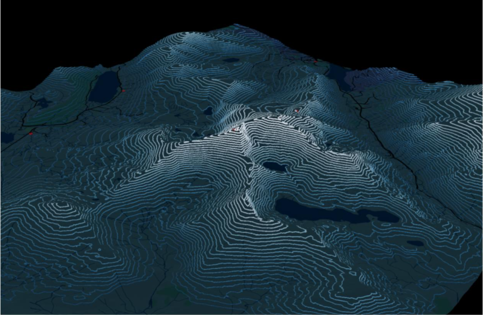
Getting the contours right for the 3D element required a little manipulation. Index contours were too limited with the 50m intervals whilst the normal contours were too detailed at every 10m. I therefore queried the dataset to include every 20m over 1,000m (1,000m,1,020m, 1,040m, 1,060m, 1,080m), then every 30m down to 490m and then every 40m down to 10m. If you have read Wes’ blog, then you will understand what the following settings relate to visualising the contours:
- Transparency: High = 0%, Low = 70%
- Colour: Reds Continuous (flipped)
- Size: Min = 1pt, Max =1.5pt
One affect that I would have liked to of included would be to have the water features as 3D (e.g. a tube), and dropping between each contour like waterfalls. However, my graphics card was not overly happy with this idea and I couldn’t render the desired effect without my laptop crashing!
Summary
Once I had all the individual elements of the map decided, it was then a case of setting up the final template. As an admirer of Kenneth Field's cartographic advice, I asked for feedback from my colleagues on the map. I was really pleased I did as changes to certain aspects of the map have certainly improved the final output. And as always, maps are about personal preferences – I wanted the map style to look minimalistic, but that is not stopping others from creating something similar but using more features or labels. As already mentioned, all the data is open and free to use, so go download a copy and make a map of your favourite area.

Our highly accurate geospatial data and printed maps help individuals, governments and companies to understand the world, both in Britain and overseas.