OS maps go off the planet
The planet Mars has become the latest subject in our long line of iconic OS paper maps
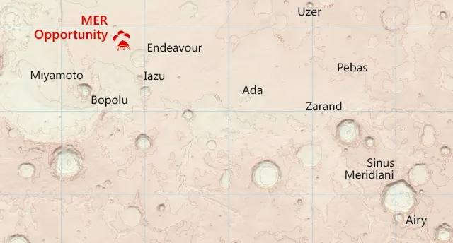
Our Cartographic Designer, Chris Wesson, designed the map over a couple of months. You can see his favourite section of the map below, and we’ve caught up with Chris to find out about the unusual challenges of mapping the red planet the OS way.
What makes your map different from other Mars maps?
Well it’s definitely the only one I’ve ever made! But seriously, I think even though the principles are the same, the design and the aesthetics of an Earth map differ considerably from any planetary map that I’ve seen before. That, for me, is the biggest difference. I love planetary maps and find them visually very appealing. In fact at the 2015 International Cartographic Conference the poster map of the moon by MIIGAiK Extra-terrestrial Laboratory was one of my favourite maps on show – but they do often seem to be, as is their inherent nature, very scientific and unnatural in their presentation. We have set out from the start to treat the Mars data no different to how we would OS GB data or any other Earth-based geographic information or landscape.
What OS ingredients are added that do not exist on other Mars maps?
The cartographic style is something that is very different to your typical planetary map and is identifiable as an OS map. The key ingredients to this style are the soft colour palette, the traditional map features such as contours (in brown-orange) and grid lines (in cyan), and the map sheet layout complete with legend. We even have a far more traditional representation of map components such as title, scale bar and graticules when compared with equivalent maps by space agencies and so on. Various cartographic techniques such as multiple lighting angles and exaggerations have also been used to enhance the shading of the relief, as well as to produce a generalised set of contour lines and optimise map label placement.
What difficulties did you have to overcome to make your Mars map?
At first it took a while to get my head around the height information. A lot of the area of the map is at a minus elevation. My over-simplistic understanding is that this is because the zero level is what would hypothetically be mean sea level if there was enough water on Mars to equate to Earth.
Mars is a very different topography to the Earth to map. The surface is very bumpy but at such a large scale I had vast expanses of land that appeared flat relative to the craters each of several thousands of metres depth, hence the need for different lighting and surface exaggerations. This varying topography led to several attempts by trial and error to find a workable contour interval. Also the contours, which I generated from the elevation data, were very complex and jagged in appearance; trying to smooth them was quite a challenge.
Why does it not look all red and how we think of Mars? (How come you did not colour it all different shades of red?)
Mars is ‘the red planet’ but Earth-based maps are not always blue and green. Maps of Mars tend to take on more muted shades of red, use a rich colour palette more synonymous with planetary mapping or stick to greyscale. What I wanted to achieve, or at least to investigate if it were possible, was to represent the data in the way OS would have had we been given Earth data to create a regular map sheet in a typical OS style. Using shades of just one colour makes it harder to see and picture the landscape and all the features within it from a map. Red is also a very dominant colour that is not very supporting of thematic overlays such as landing sites or place names.
Before this map, what is the most unusual map you have made?
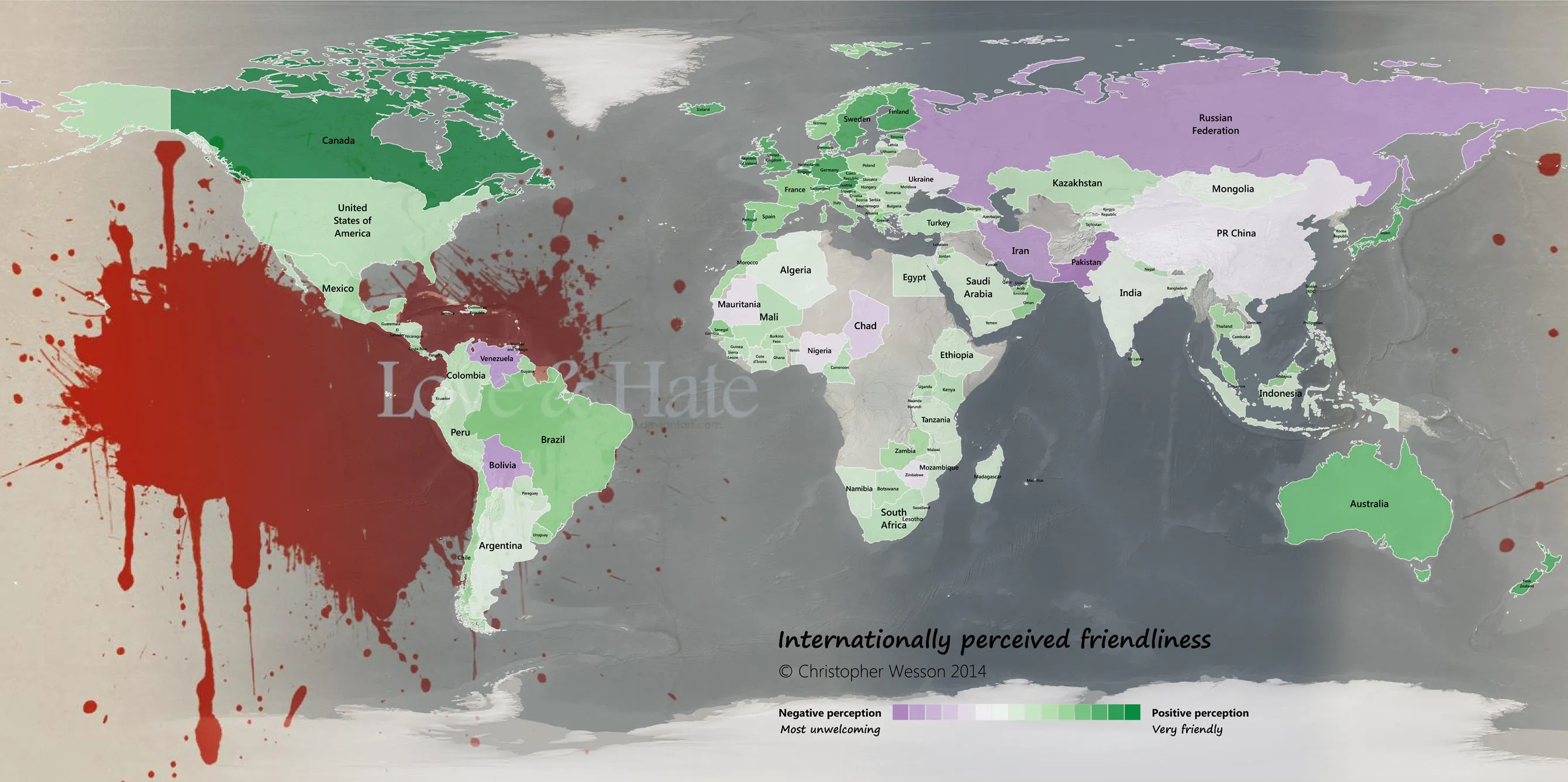
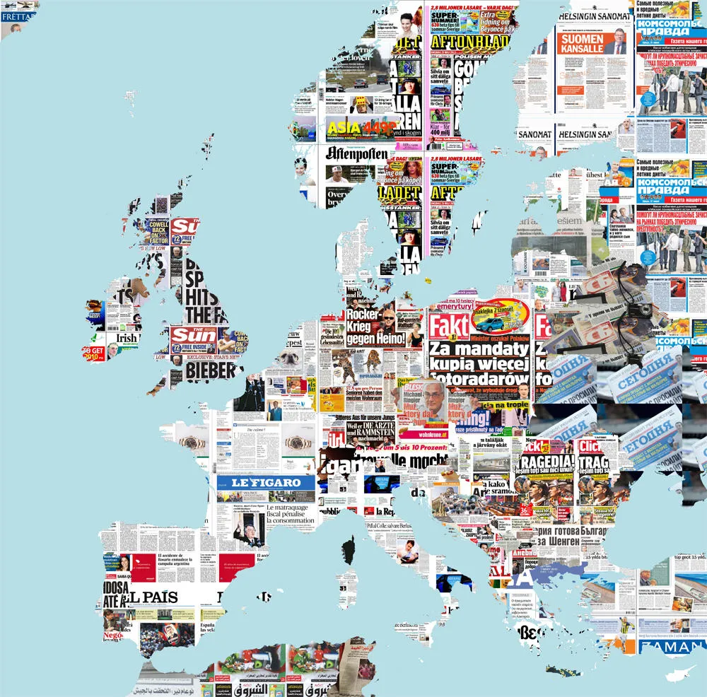
Ha-ha! Outside of OS, I have made a few maps on my personal blog that others might consider to be strange or unusual, particularly the International World Friendliness map. I combined data from several sources about how ‘friendly’ countries around the World are perceived to be and create one fairly normal map and another blood-stained version that met with some cartographic criticism. Another unusual map was of the best-selling newspapers in each country of Europe (at the time) shown by the current front page (on the day of creation) of each paper. As well as showing the leading newspapers by sales, the idea was that each front page would update each day automatically. Sadly the database behind my blog is currently lost so I’m working with the service provider to try to recover it, but these maps can be seen below.
Do you think that one day people may be walking on the surface of Mars using your map (or a derivative of it) like people use OS maps in Britain today?
It is a nice thought, that one day people could pinpoint the landscape around them from a map just as in the British countryside but the map may be quite different by then.
I have to take my ski gloves off to unfold a piste map! So I imagine even if the content was useful some design thought into the product format would be required. Do astronauts have heads up displays on their visors?
Ordnance Survey Mars map
You can find out more about the Mars map in this article, if you’re a subscriber, from The Times on Saturday. You can also see the full Mars map on our Flickr account.

Our highly accurate geospatial data and printed maps help individuals, governments and companies to understand the world, both in Britain and overseas.